Trusted by
Etoile Bakery
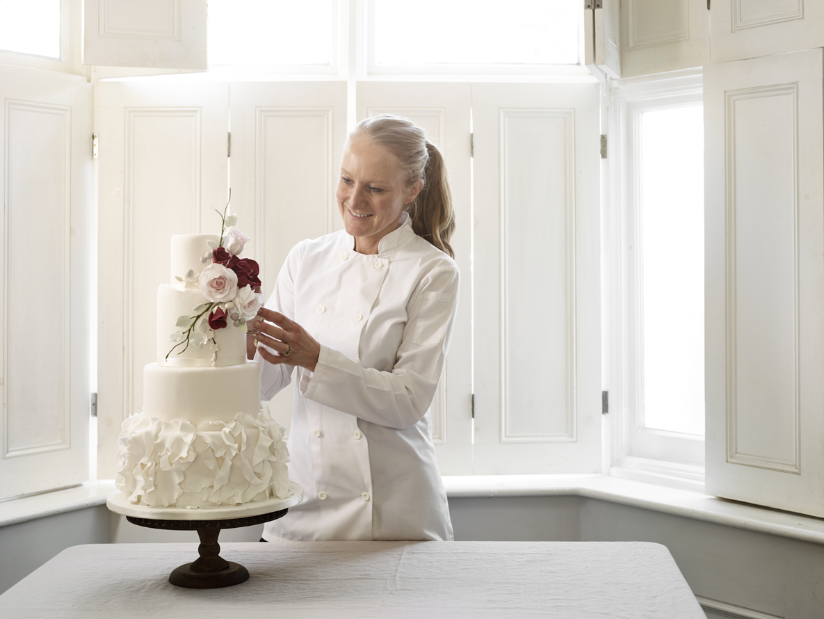
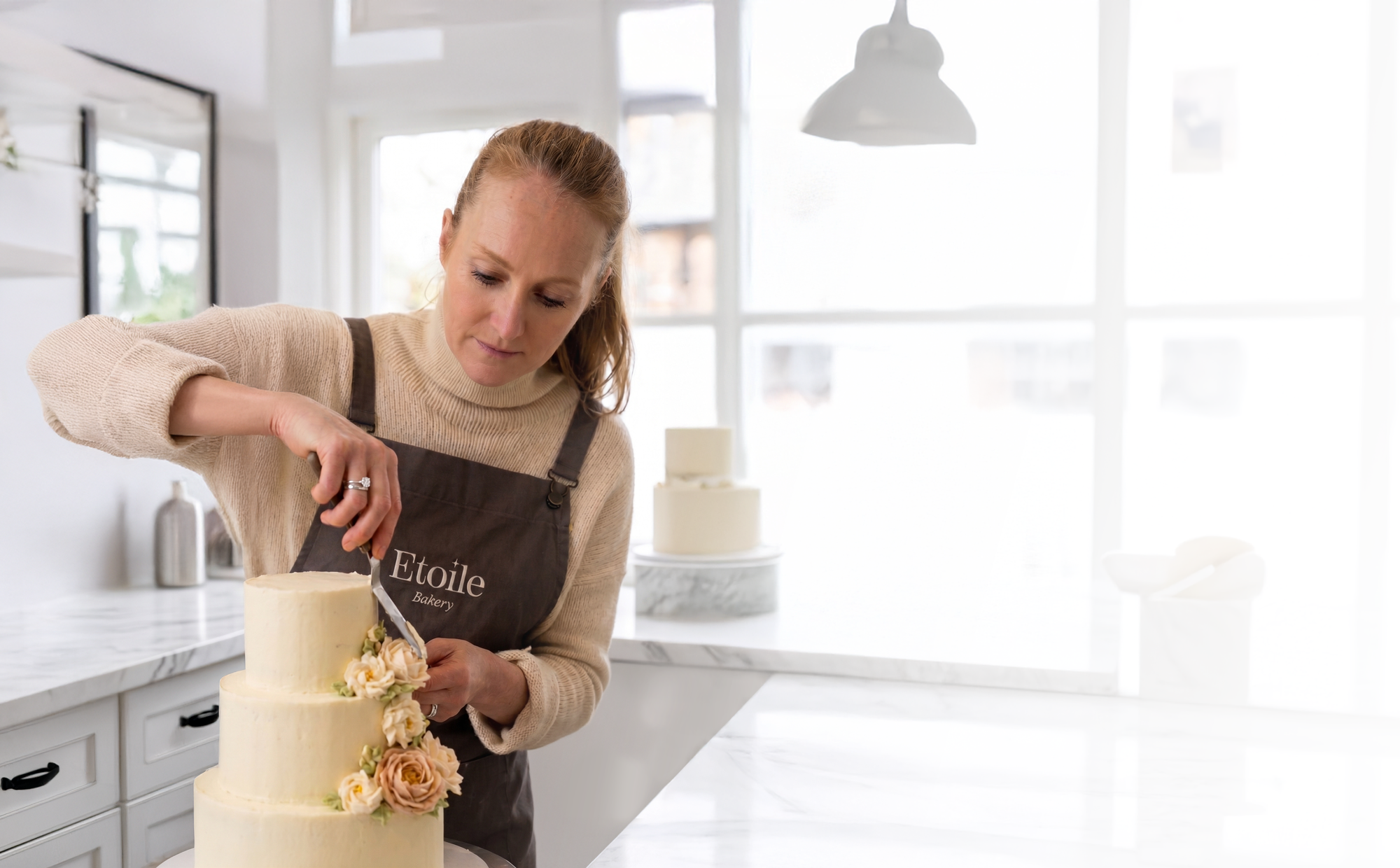
Etoile Bakery founder Holly approached me for help with her brand as she prepared to expand beyond bespoke cake designs into ready-to-order goods.
After 12 successful years, Holly was ready to grow the business - launching online sales, opening a physical location, and offering education for aspiring bakers - and needed a brand identity that could hold it all.
Situation
Despite an award-winning reputation and a client list spanning royalty, celebrities and London’s most prestigious venues, Holly’s branding wasn’t doing justice to what Etoile Bakery had already achieved.
Her website was out of date and presented her more like a hobbyist baker than a cordon-bleu trainer chef, and there was no mention of her most impressive clients.

the mission: to create a brand a brand as tasty as holly’s cakes!
My strategy was to reposition the brand to reflect as premium and aspirational. I did this by elevating the visual branding to be more sophisticated, and by giving her more notable clients prominence on her website homepage, to immediately set customer expectations highly, proving the brand’s excellence.
I also convinced Holly to drop ‘Bakery’ from the brand name to shift perception from ‘small business’ to ‘brand’, and created a brand architecture to encompass the three arms of her business - ecommerce, commissions and bakery school.
creating an elevated brand
Having discussed Holly's ideal clients and the right direction for her brand, we arrived at a clear brief: Etoile Bakery should be perceived as a luxury, design-led brand known for exquisite, high-end cakes with a modern aesthetic - combining prestige and craftsmanship to appeal to discerning clients, from celebrities to stylish professionals.
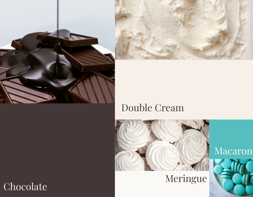
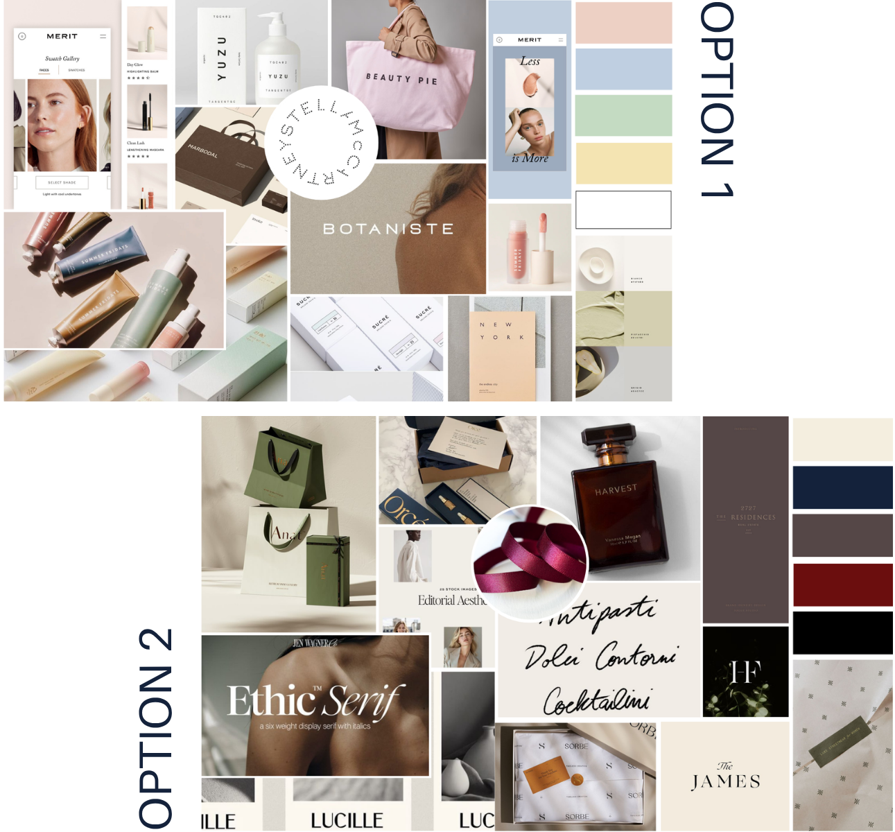
With this in mind, I presented two moodboard directions: a minimal, modern aesthetic, and a more classically luxe route, seen through a lens that felt current without losing its timelessness.
Holly opted for Option 2 - the classically luxe direction - a choice I agreed with. The pastel palette of the minimal option felt too on-the-nose for a cake brand, whereas the luxe route came across as more elegant, grown-up, and unexpected.
creative direction
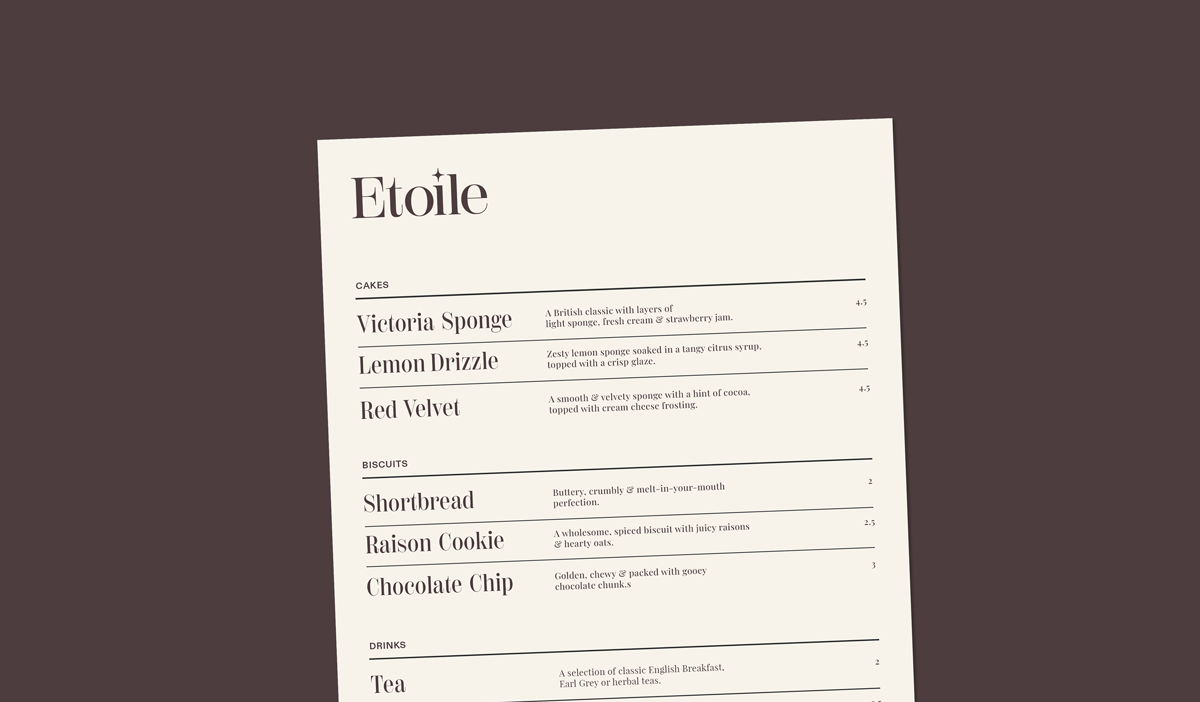
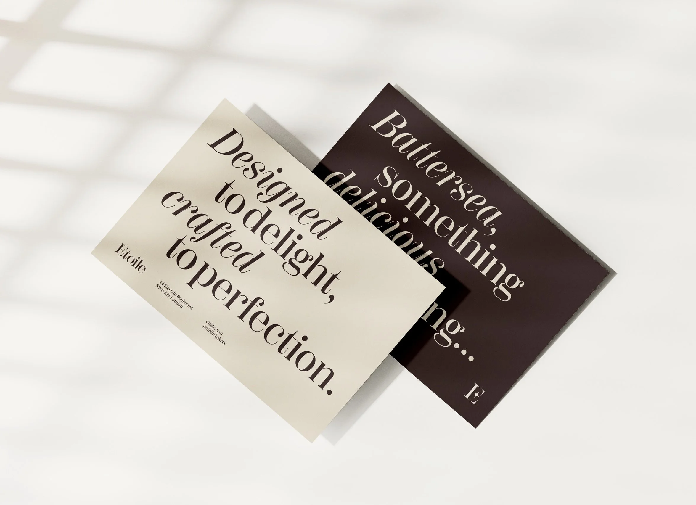
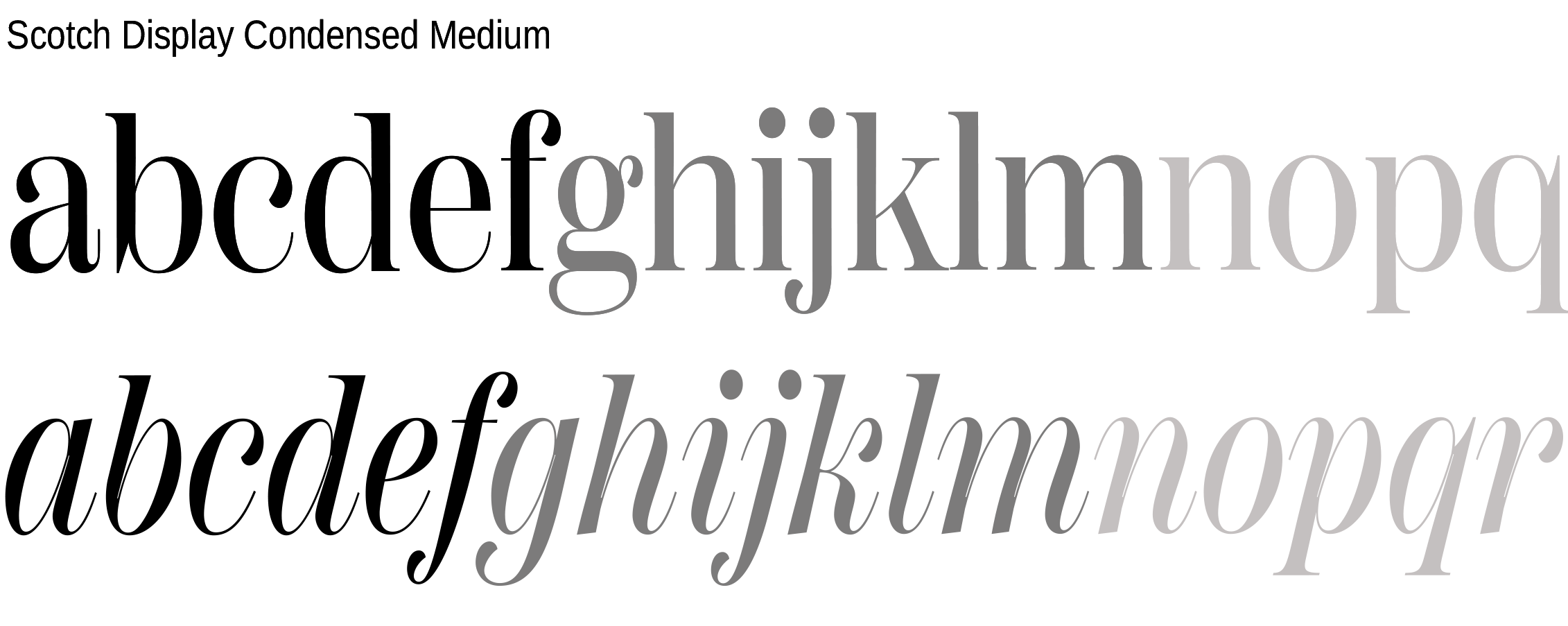
To capture the timeless elegance of the moodboard, we knew typography would be the deciding factor - so we made it our first priority. We explored lots of options, before landing on Scotch Display, which has beautiful serifs and a real sense of character.
Star quality
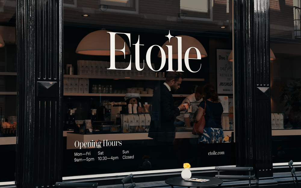
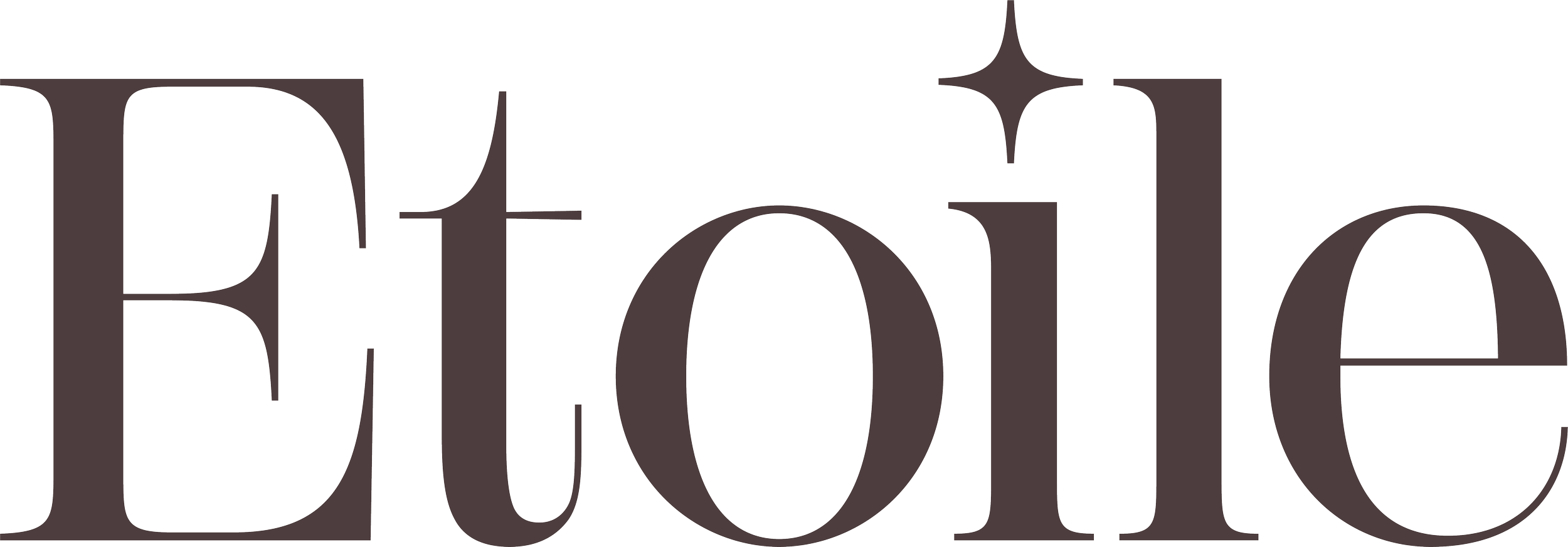
Since étoile means star in French, we wanted to give a nod to this, but in a subtle and elegant way, and so we created a star icon as the dot on the ‘i’ using the same angles as the font’s serifs.
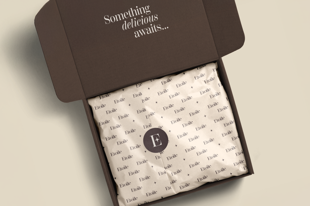
The final brand
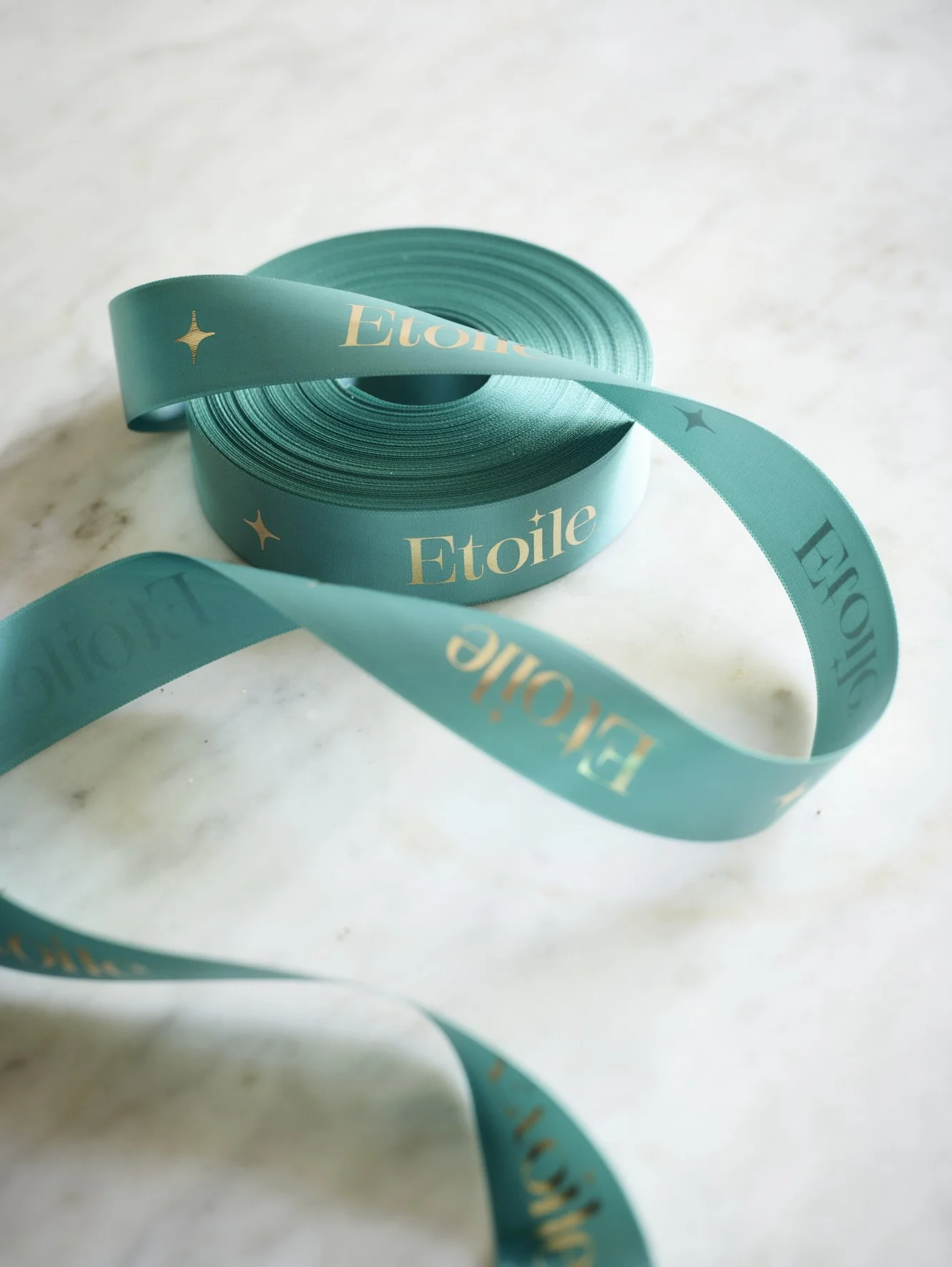
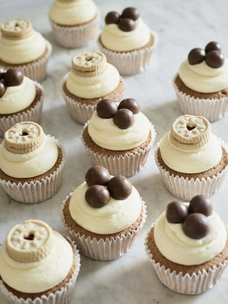
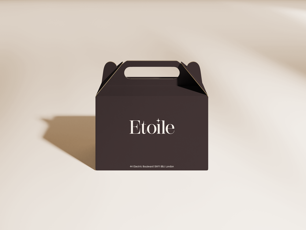
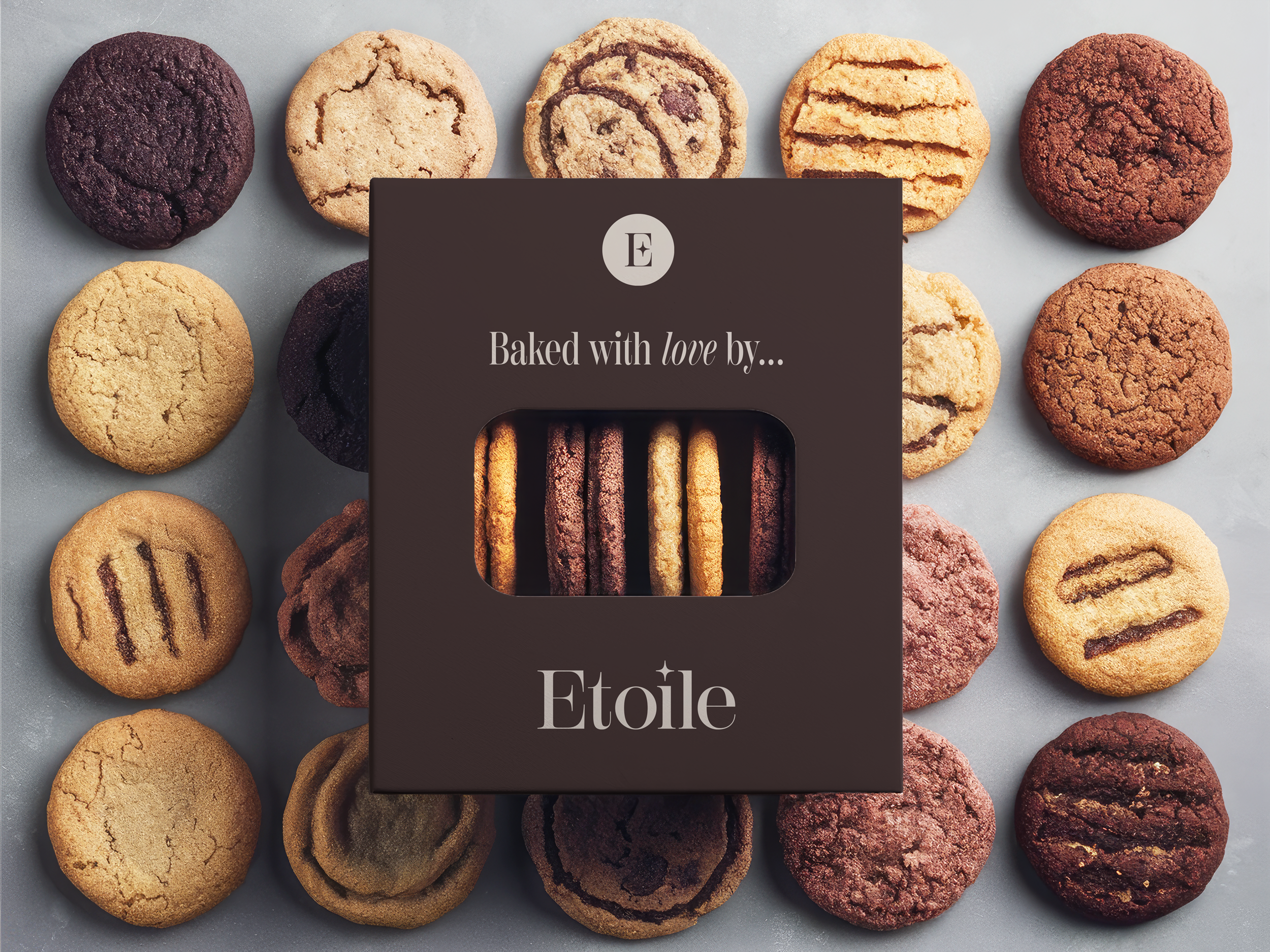
The result is a cohesive, elevated brand identity that works across every touchpoint - from packaging to digital - and a clean, intuitive ecommerce website that brings all three arms of the business together for the first time.
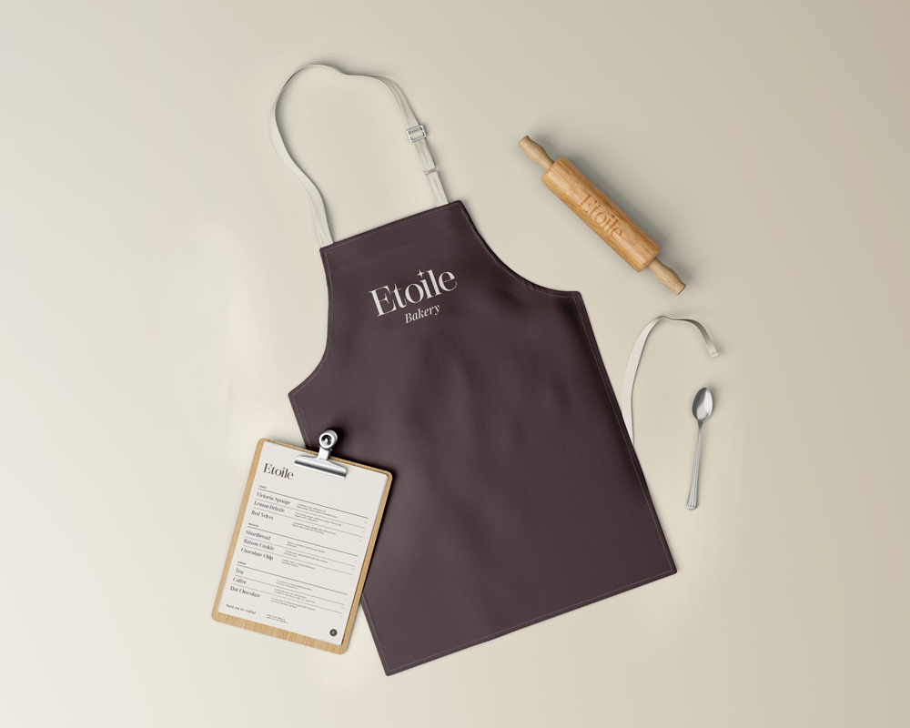
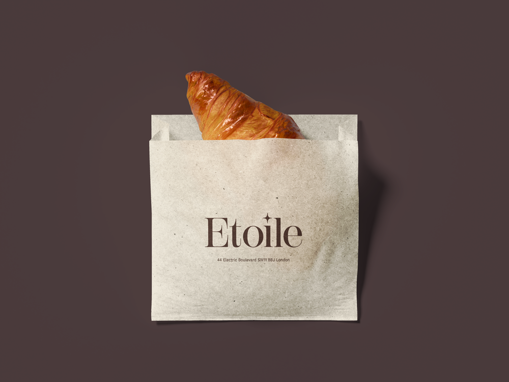
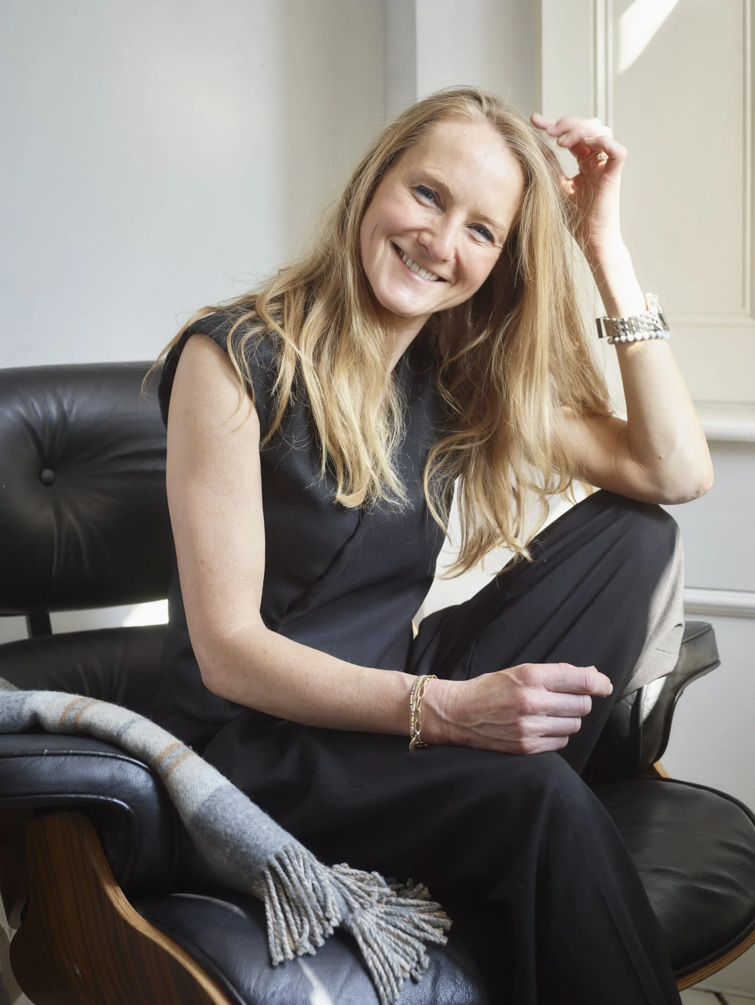
“Cara just got what I was trying to achieve from the very first meeting, and was excellent at taking something quite complex and stripping it down to make it much easier for people to understand and navigate.
The final brand is really beautiful, really luxurious feeling. She did push me a little on one of the colourways I was hesitant about, and now I see she was absolutely right. I would not have any hesitation in recommending Cara.”
— Holly Barea, Founder, Etoile