As featured by:
Franklin Lade
Having been let down by leaky lunchboxes, and wanting a sustainable and food-safe option, chemical engineer Sade developed her own range of glass food containers. Having won praise for being such good quality, she soon realised she could apply her engineer’s mind to many other kitchen essentials to create products that would save people time and hassle, while looking elegant and understated.
We worked with Sade to develop a complete visual identity for her brand, Franklin Lade, from the logo through to the product packaging, ecommerce website and marketing materials.
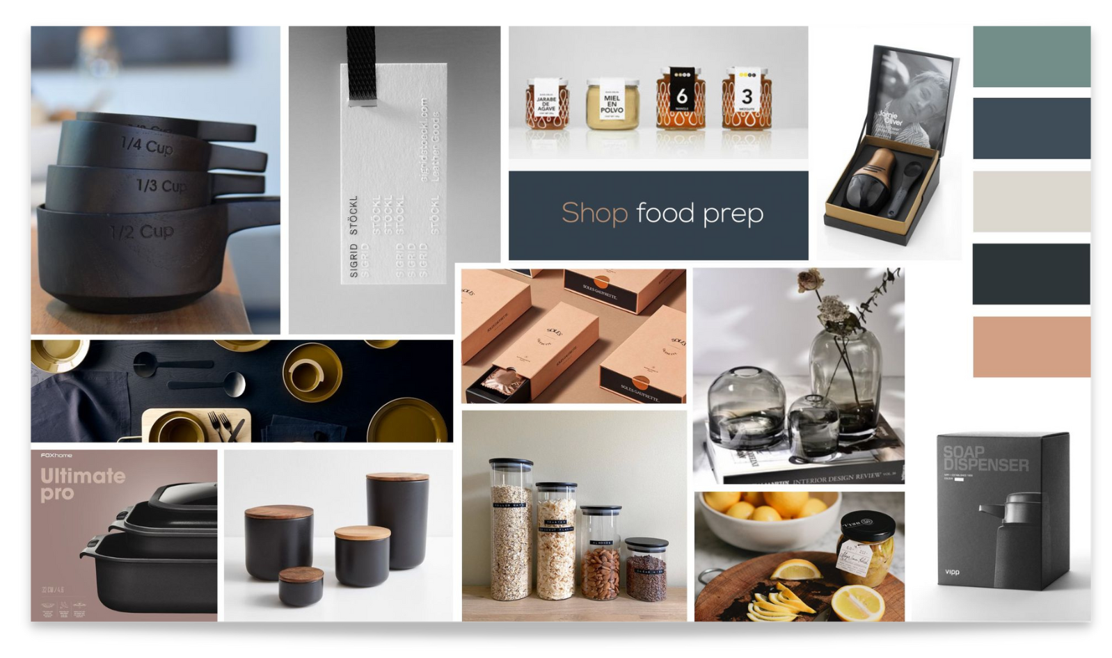
Moodboard
We wanted the brand to be premium and minimal in feel, so we chose a sophisticated style with muted colour palette featuring off white, charcoal grey, steely blues and a contrasting peach tone.
The Logo
As the brand was already trading, we were initially briefed to simply improve on an existing logo.
Since our remit is always to constructively challenge our clients for the best outcomes, we also presented a new logo concept using the shape of the containers to inspire an abstract brand mark.
Sade loved the idea, and we centred the entire visual identity on the concept of these modular shapes.
The tagline
The brand’s tagline Precision Engineered Kitchenware came to me during my discovery session with Sade. Initially she was unsure about having her own story as a central part of the brand’s narrative, but once she was able to see the power of this story for the brand, on the website and for future press coverage, she was completely onboard.

Art direction
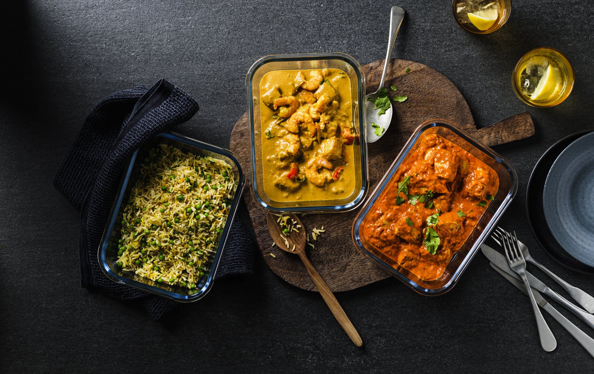
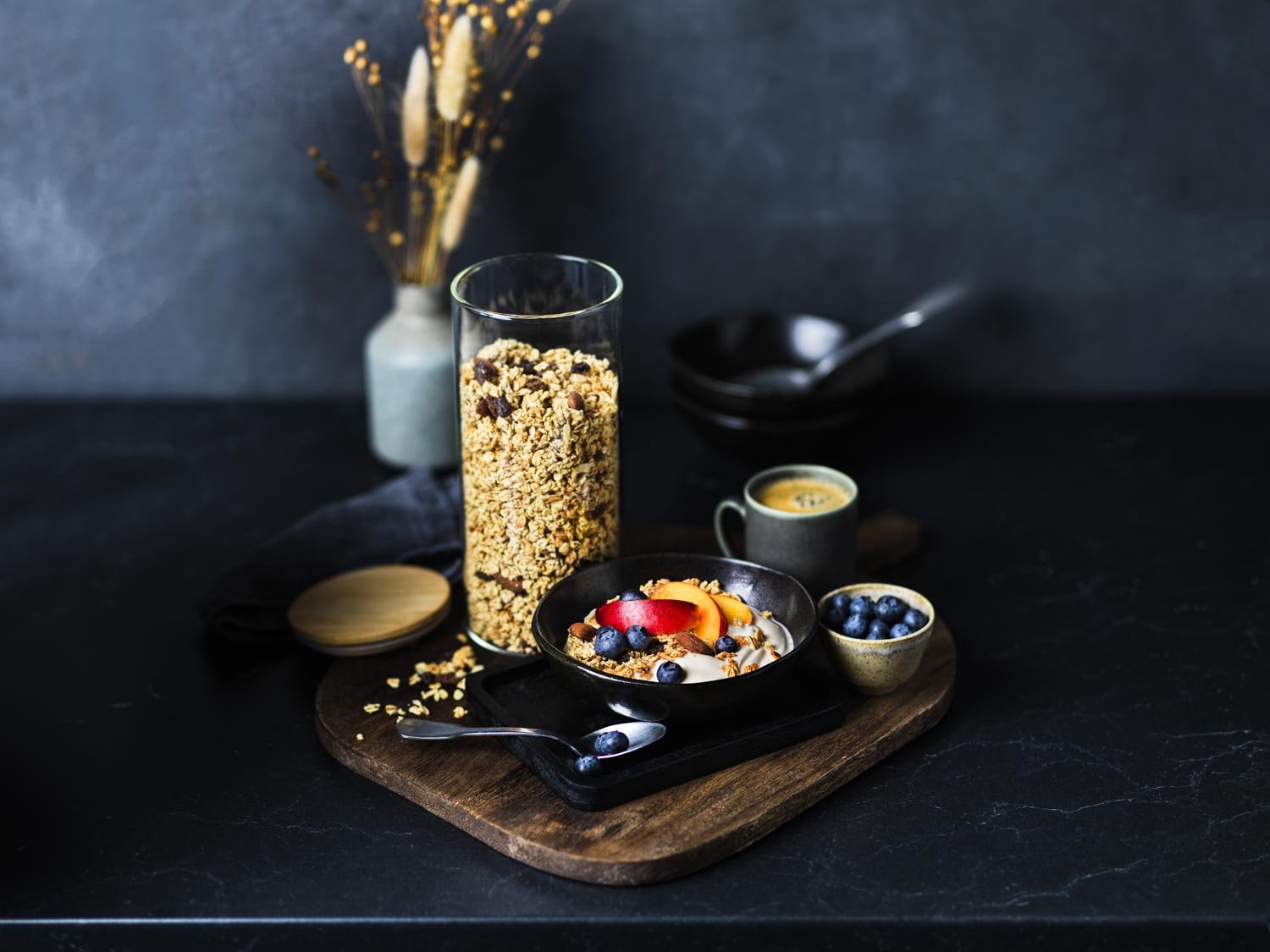
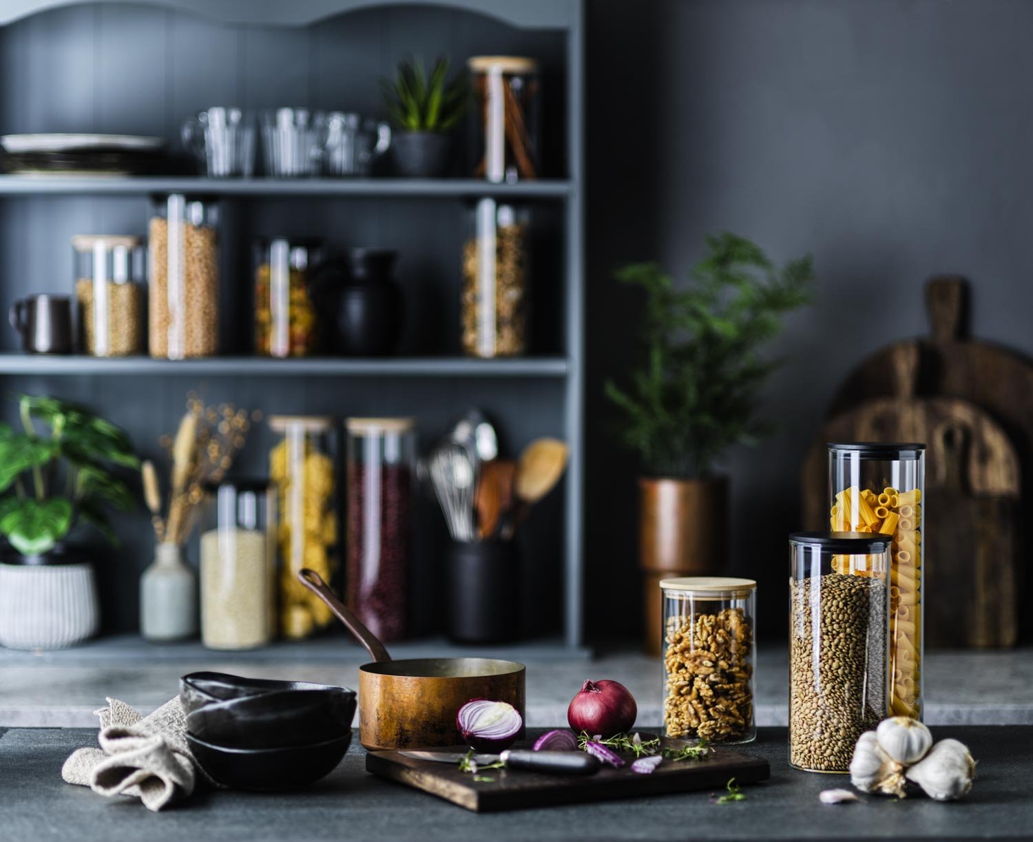
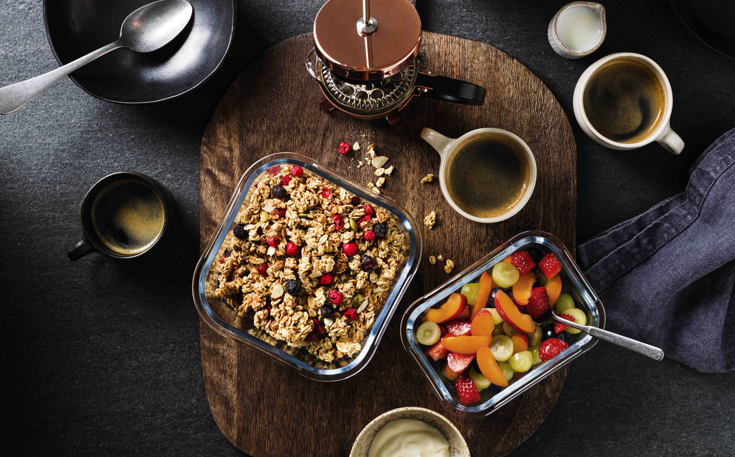
Something else that Sade described during our discovery was her pursuit for minimal products, and more specifically chic black kitchenware rather than colourful gadgets. I always seek ways in which we can make a product stand out from its competitors, and this statement lay the foundation – instead of going for the usual bright and colourful styling of most other food prep brands, we would opt for a distinct darker aesthetic.
We came across a photographer whose style fit the brief perfectly – award-winning photographer Karen Thomas – and shot the range over 3 shoots at her studio.


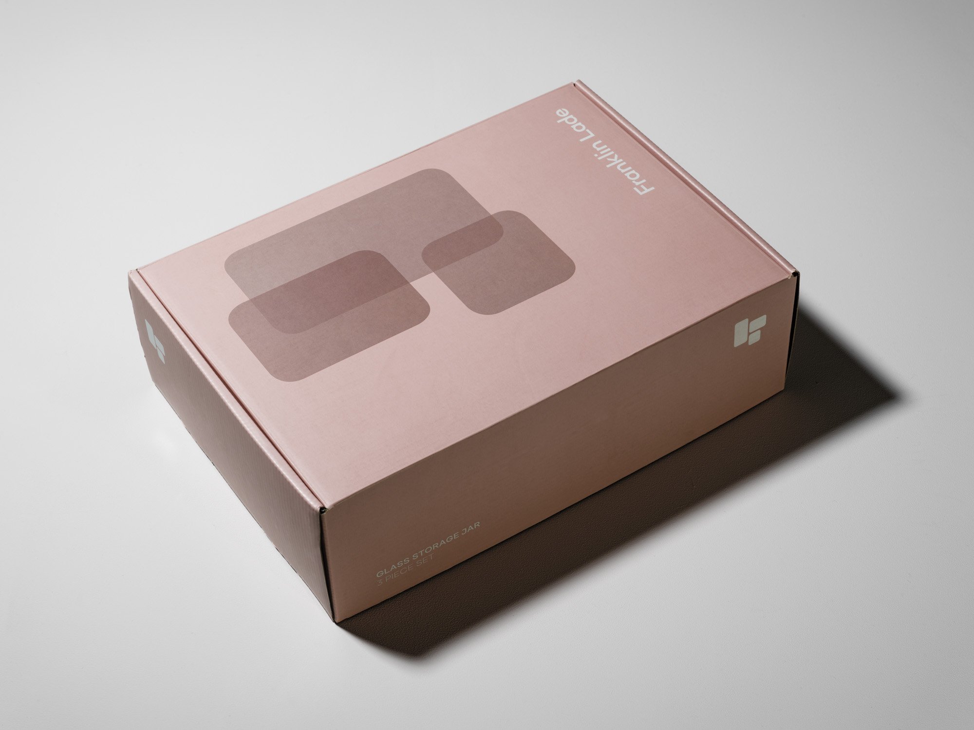
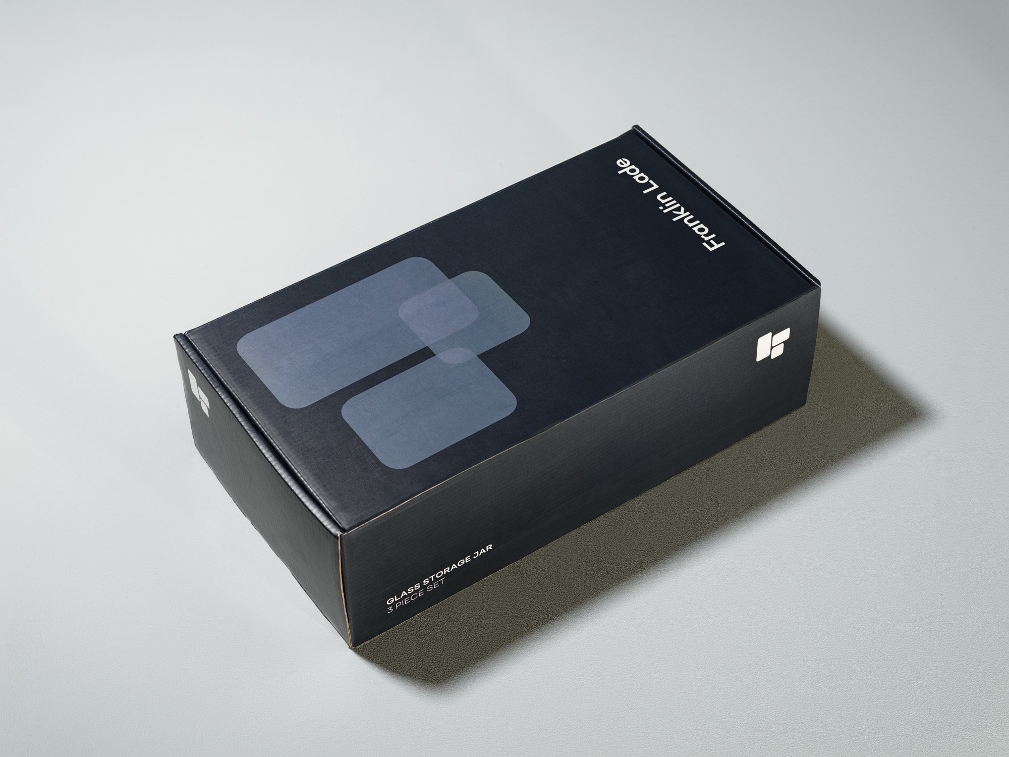
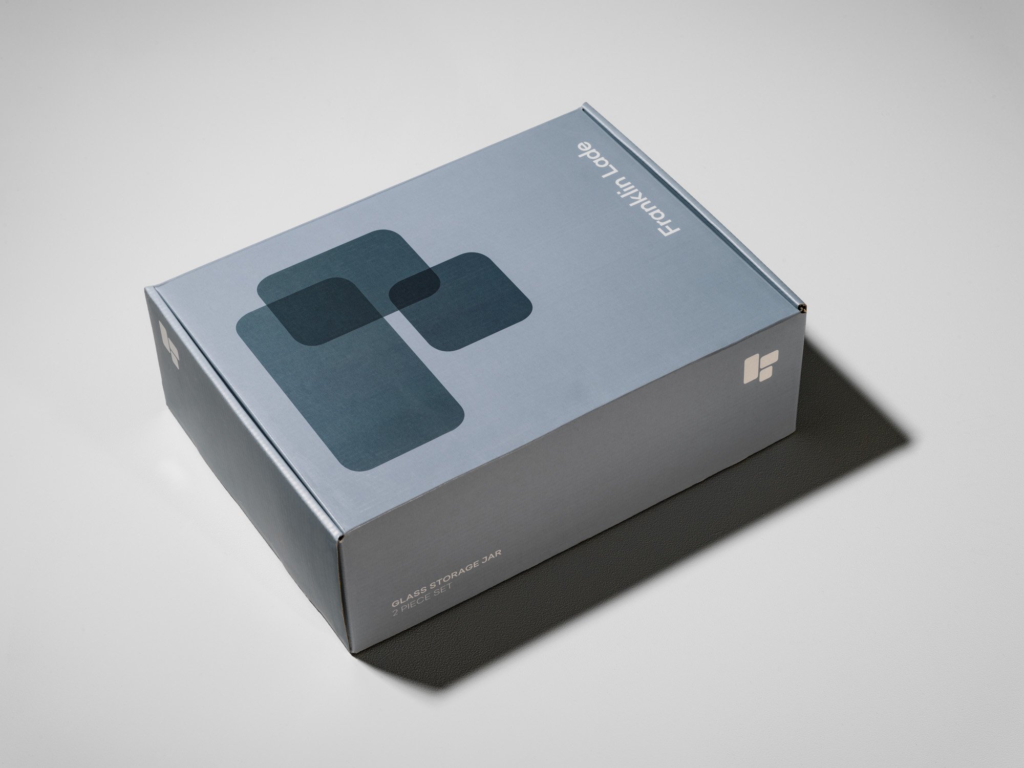
Packaging
We designed a range of the boxes, utilising the different shades from the brand’s colour palette, and each featuring a variant of the main brand emblem. We also designed tissue paper for the packaging of the glass jars, alongside a front opening box to give the recipient a positive unboxing experience.
We designed a gatefold insert to contain the thank you message and key product information. We opted for a QR code linking to the website for displaying the product care information and returns policy, to minimise the amount of print materials needed for each package.
One of our biggest challenges with the packaging was knowing it had to protect glass items in transit, while also wanting to eliminate the use of plastic or polystyrene.
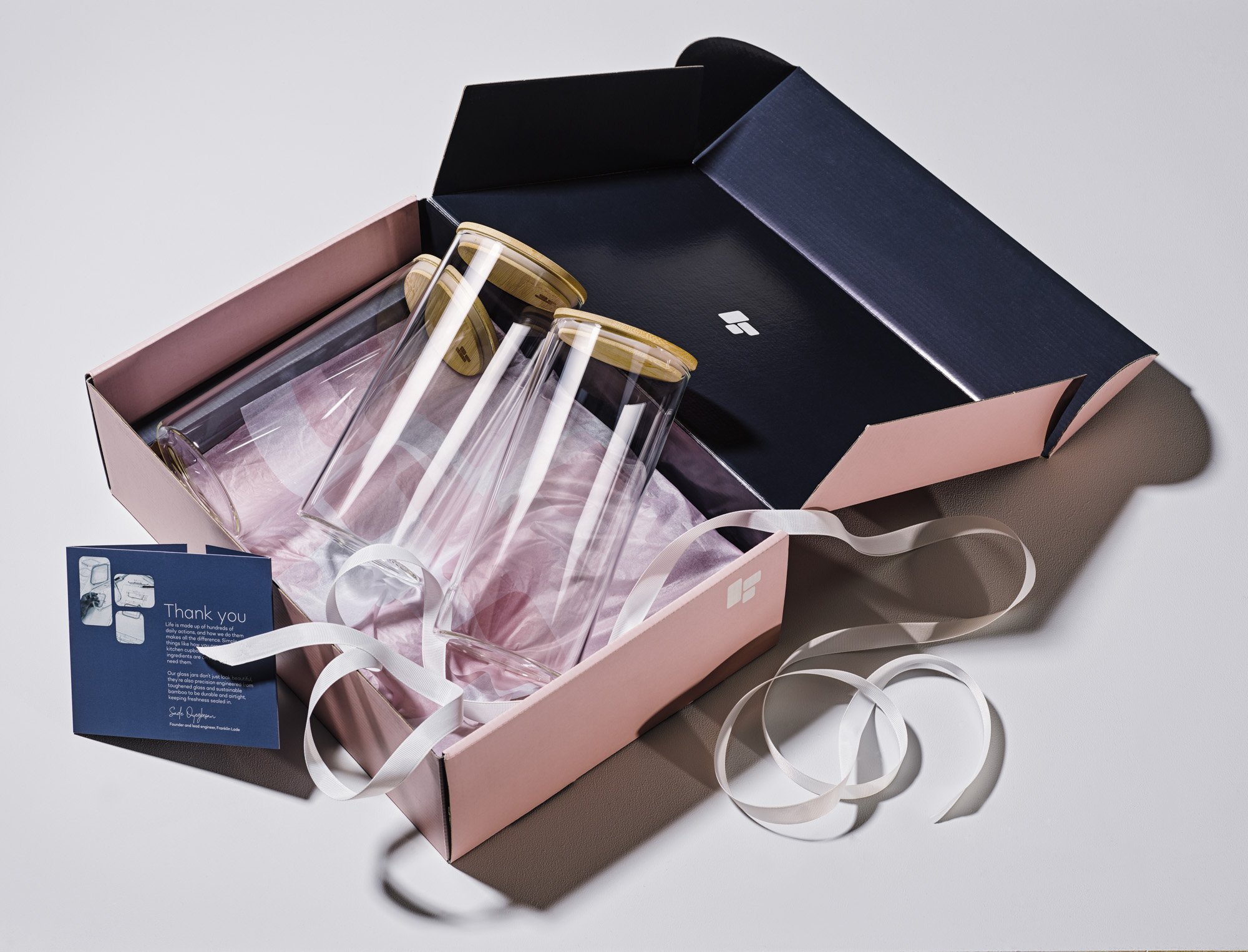
We found a solution by using recycled paper to prevent scratching, honeycomb kraft paper to cushion the glass and carefully measured boxes to avoid excess movement within.
The packaging is completely recyclable, plastic free, and uses FSC certified mixed recycled materials.
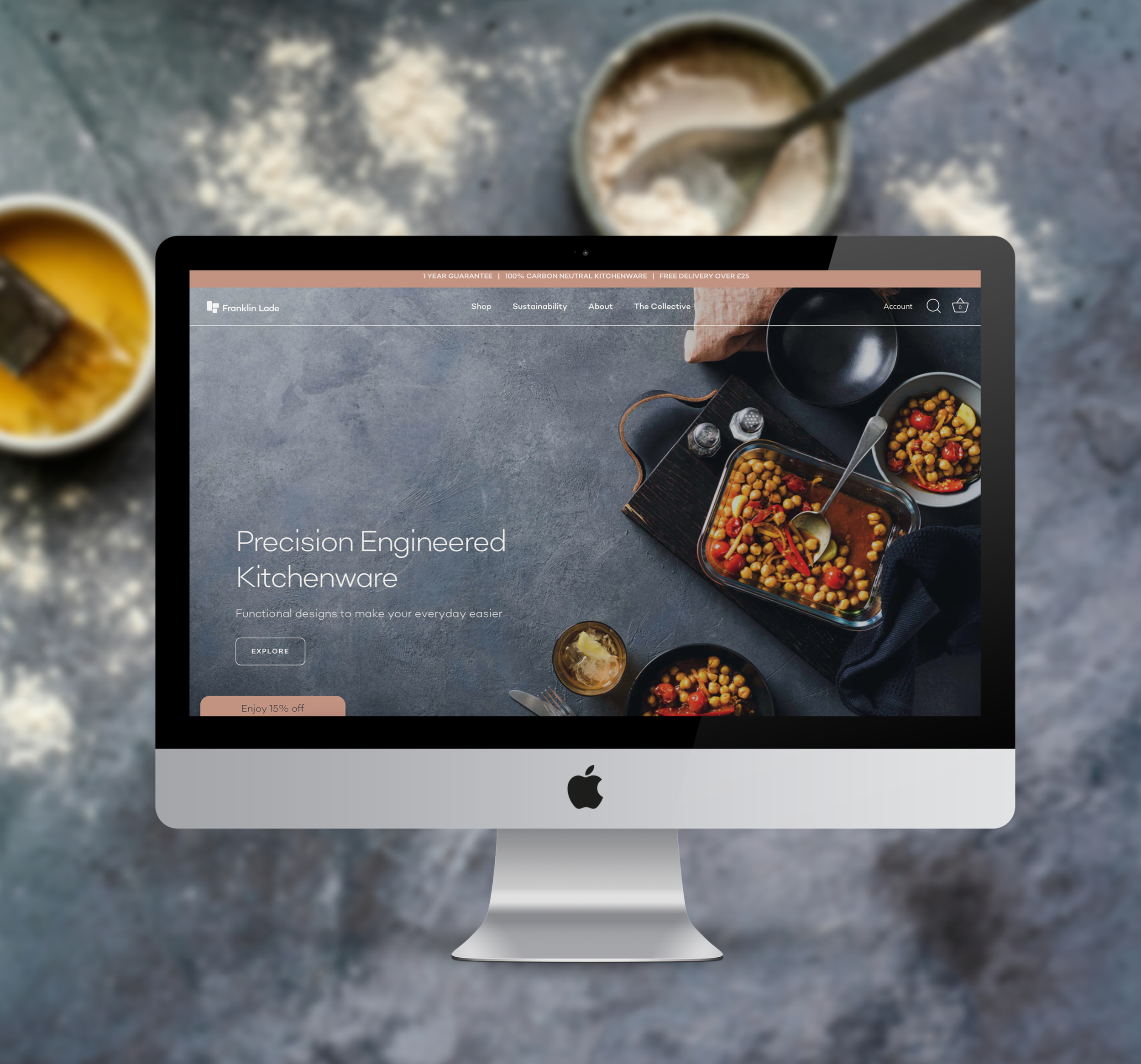
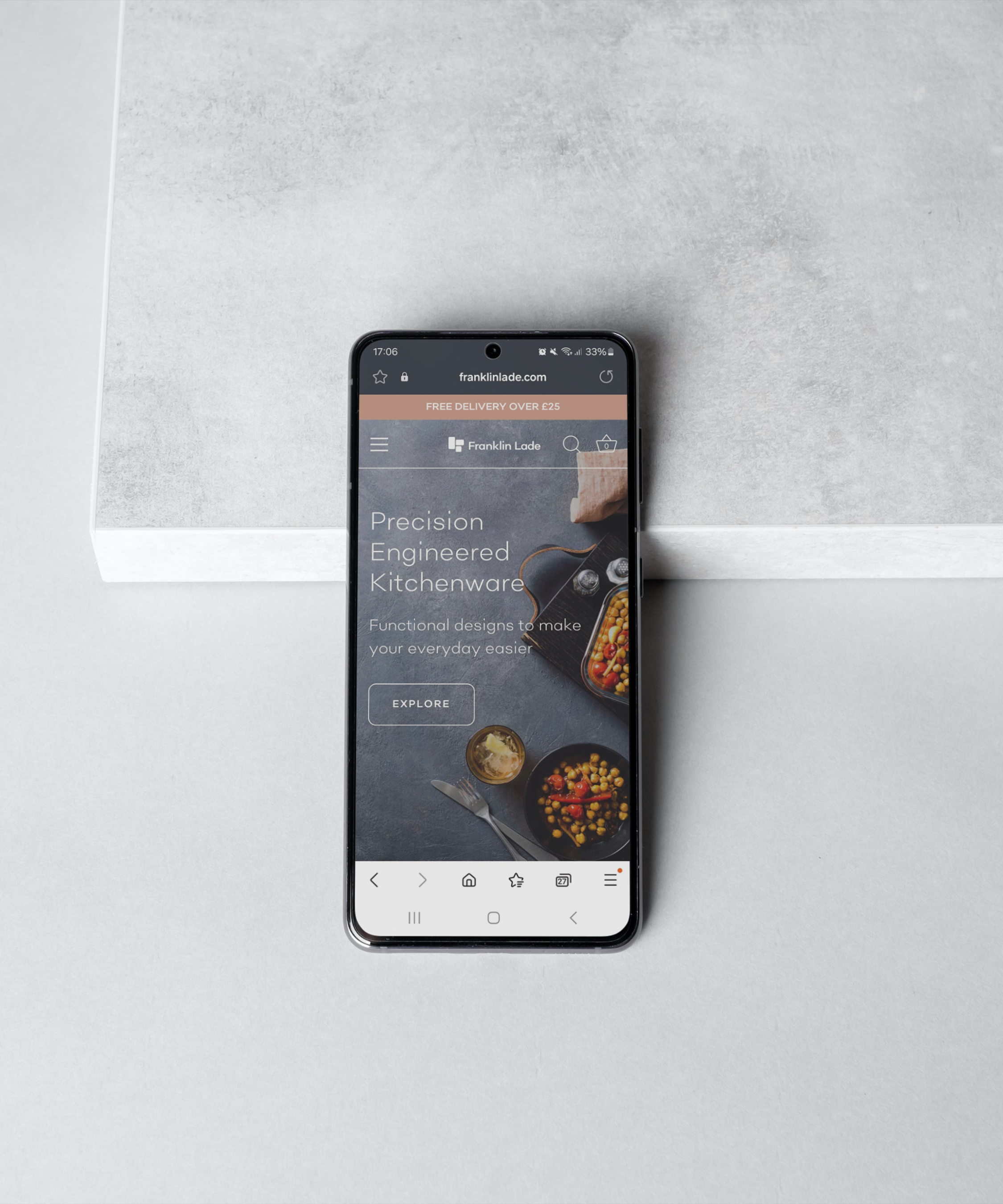
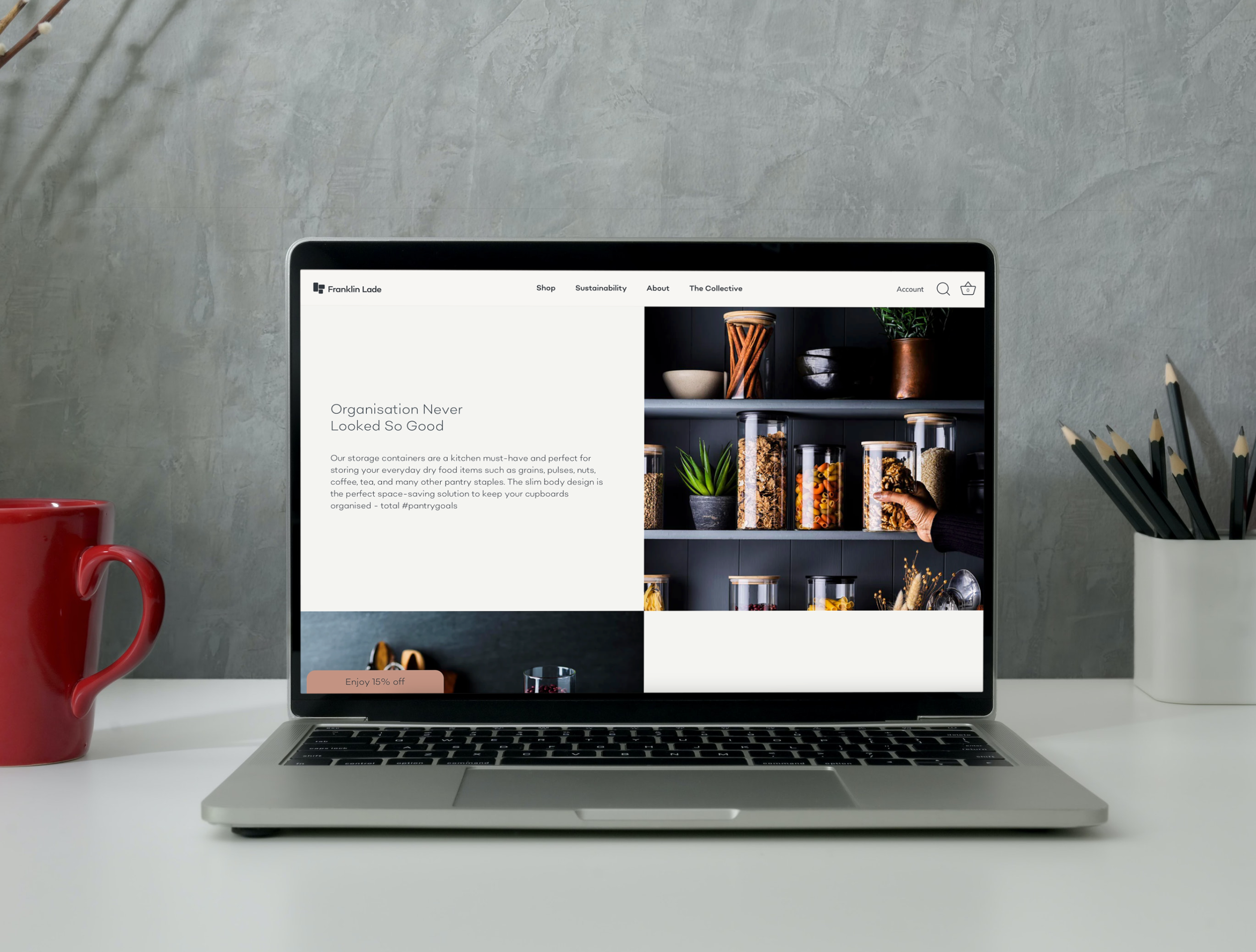
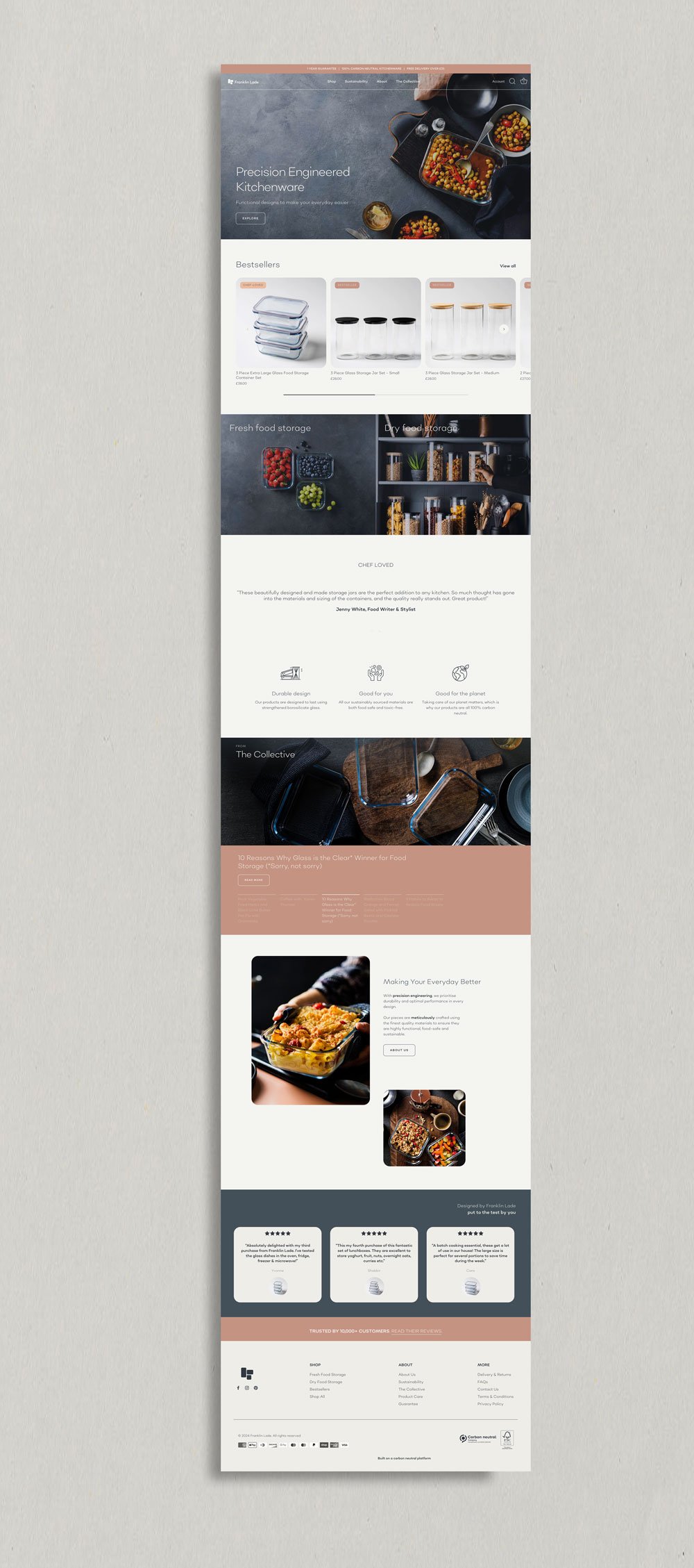
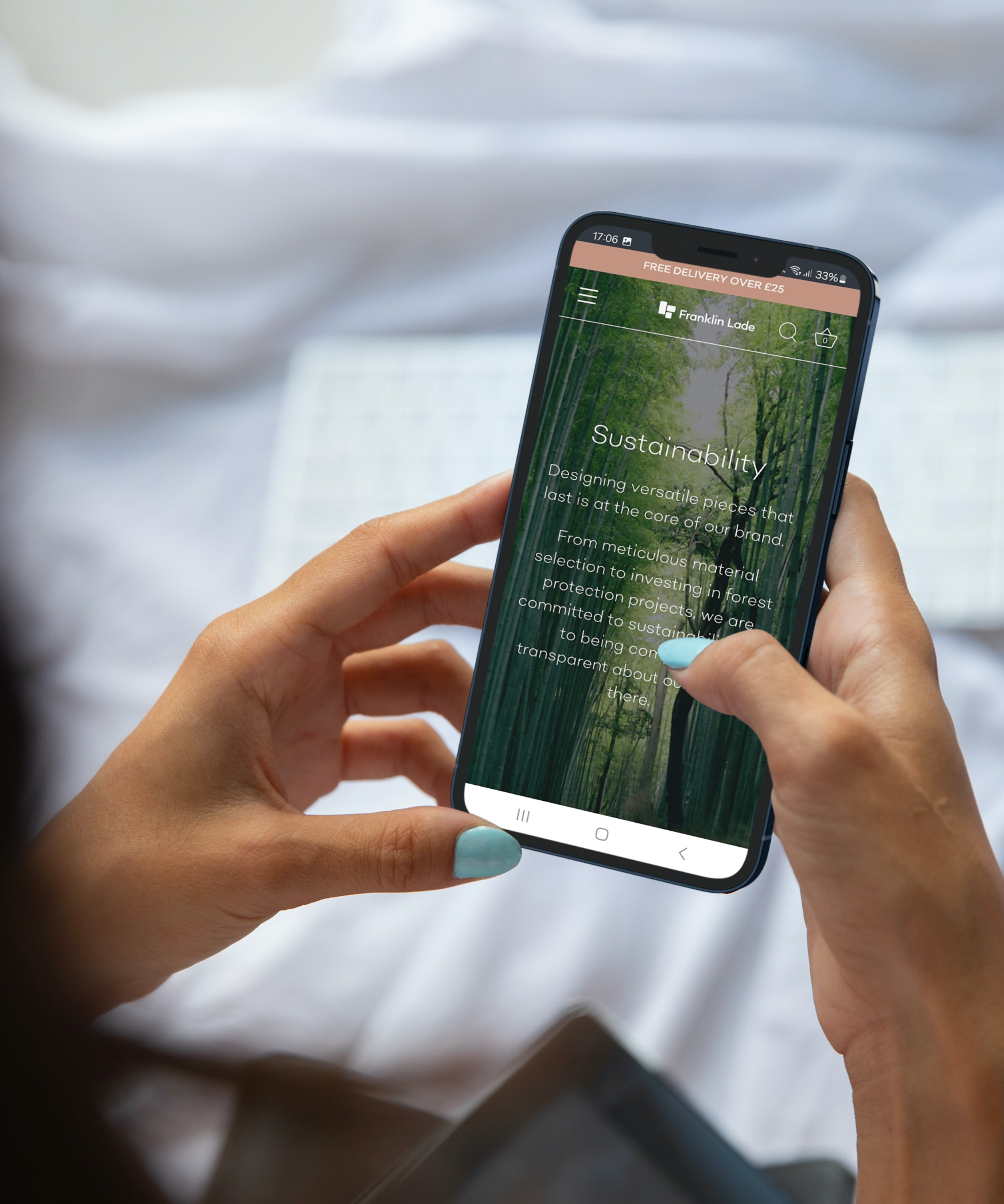
Website
We created a top of the range responsive commerce website for the brand using Shopify. Not only does the site look aesthetically pleasing, it was also designed with optimum user-experience in mind, and includes bespoke features such as a ‘Carbon Calculator’ which shows customers precisely how much carbon has been offset for each item they add to their basket. Why not take a look for yourself?