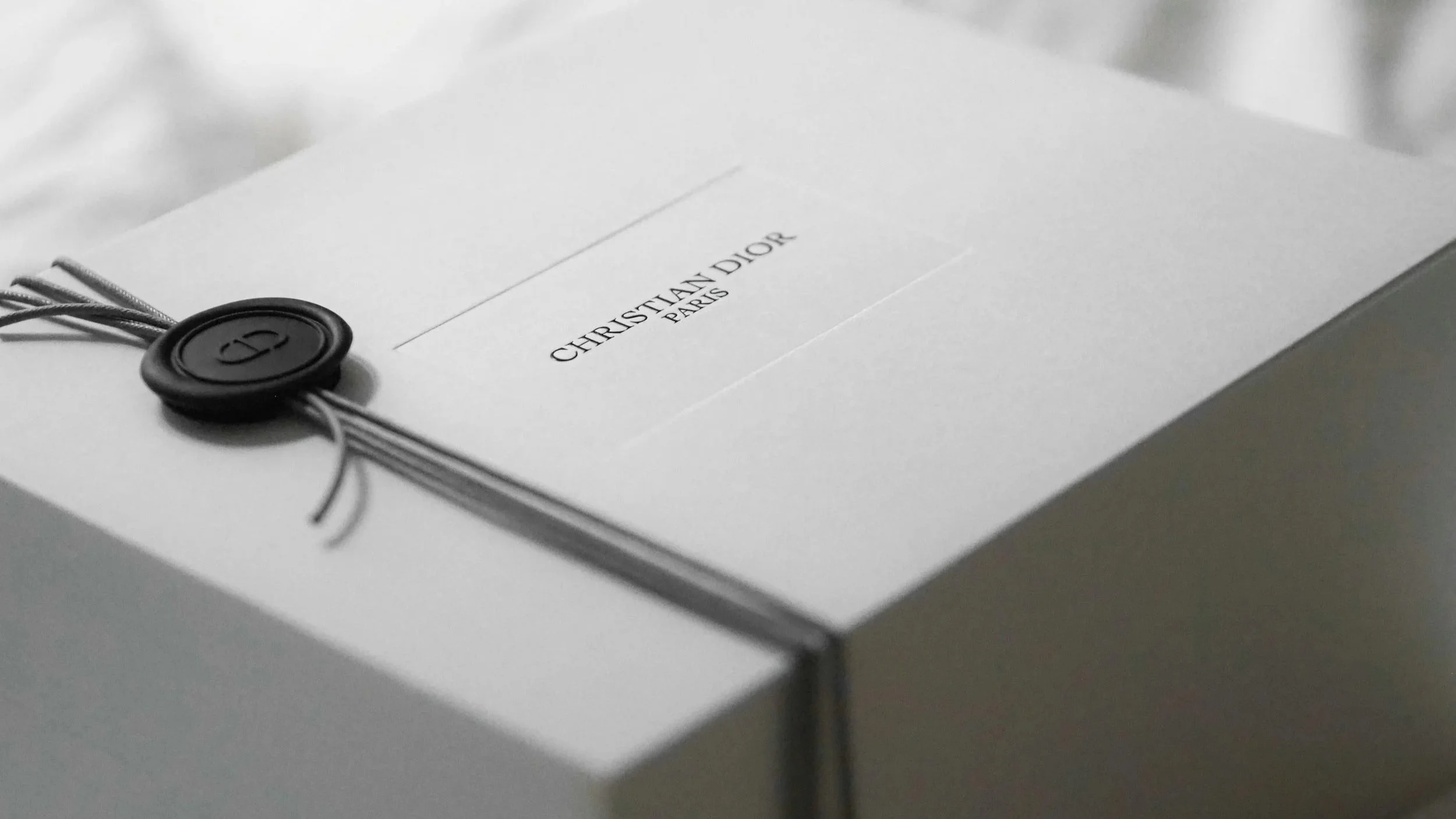
Why Do All Fashion Logos Look The Same?
In the wake of London Fashion Week, I thought I would share some thoughts on fashion branding – most notably why so many brands’ logos are much of a muchness.
Now before you comment telling me all the exceptions there are, I’d like to say that this is, of course, a general overview. But the evidence stacks up – try searching the name of a fashion label, and 75% of the time it is a black & white typographic logo that comes up.
As someone who loves fashion as much as I do, this has always frustrated me; after all, fashion is so fun!
[Please note that this article was originally written in early 2018, so some brands may since have updated their logos.]
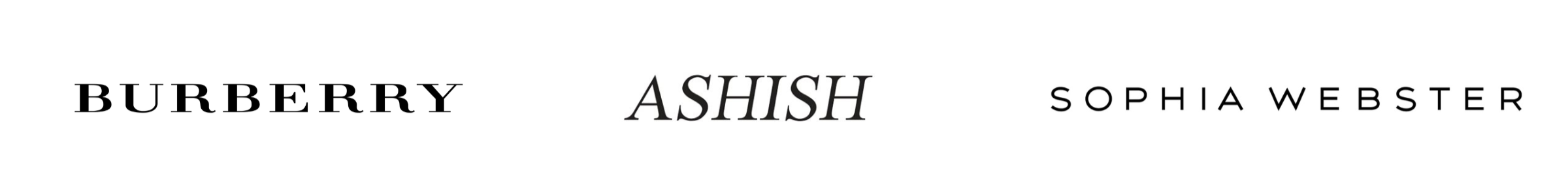
At London Fashion Week, models for Ashish, Burberry and Sophia Webster’s Autumn/Winter collections walked the catwalk in bold designs, full of colour, sparkle and personality…
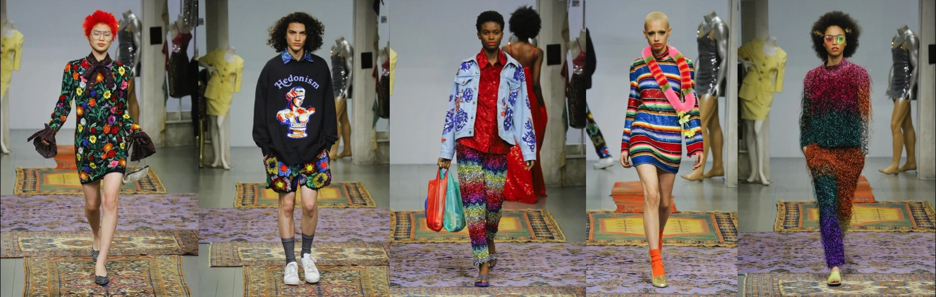
Ashish AW 18 catwalk at LFW. Photos: Luca Tombolini / Indigital.tv
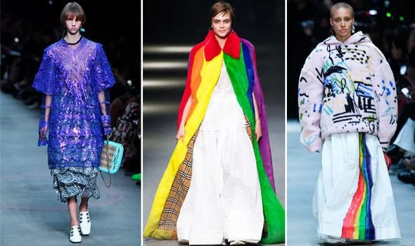
Burberry AW 18, Creative Director Christopher Bailey's final collection for the brand. Photos: Getty via London Fashion Week
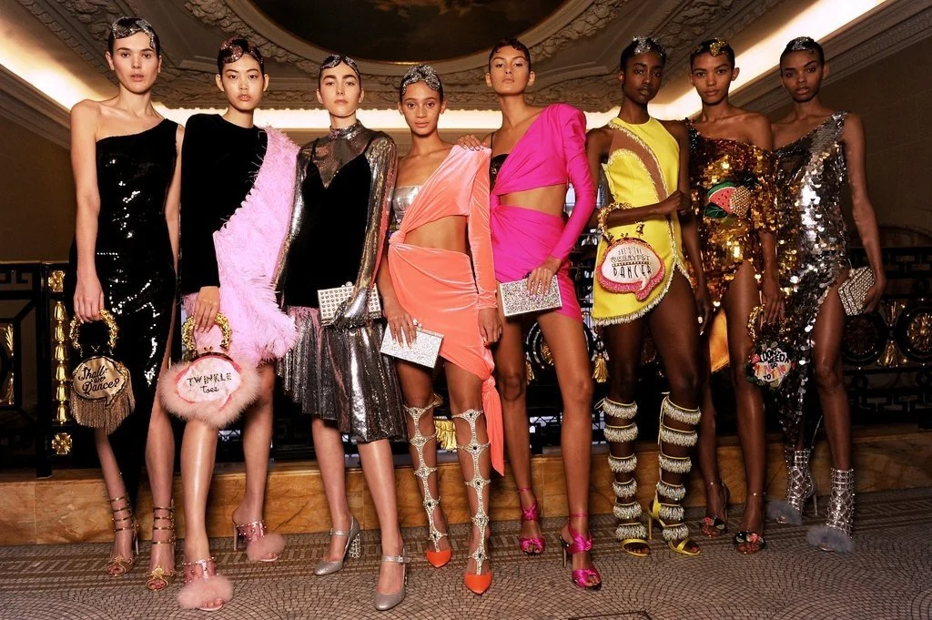
Faux fur, sequins and kitsch glamour at Sophia Webster AW18. Photo: Sophia Webster
But their logos?
Well, they tell a different story. A story of playing it safe and falling in line with the unspoken rule that all fashion brands should have a monochrome logo…
Déjà vu?
The more you look, the more cases you’ll find of similar fashion branding... Much like an art gallery with plain white walls, the ever-popular black typographic logo sets aside its own personality in order to showcase its works. Burberry’s AW18 show (above) couldn’t be more different from the practical raincoats the brand became famous for in the 19th century, but yet the logo has been mostly unchanged in 150 years.
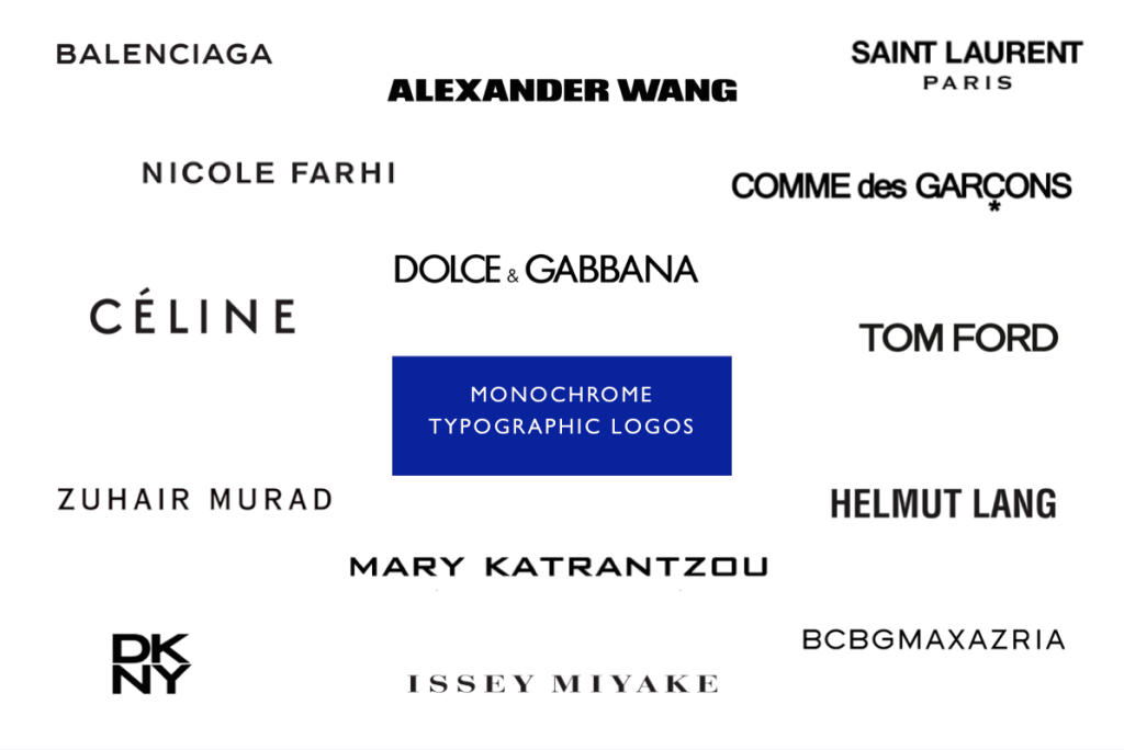
Seem familiar? Not only are logos monochrome and typographic, a large number of them opt for blocky sans serif fonts, in all caps. In fact, so many brands have gone down this route, that it’s since been dubbed ‘blanding’!
The Origin of the Fashion Label
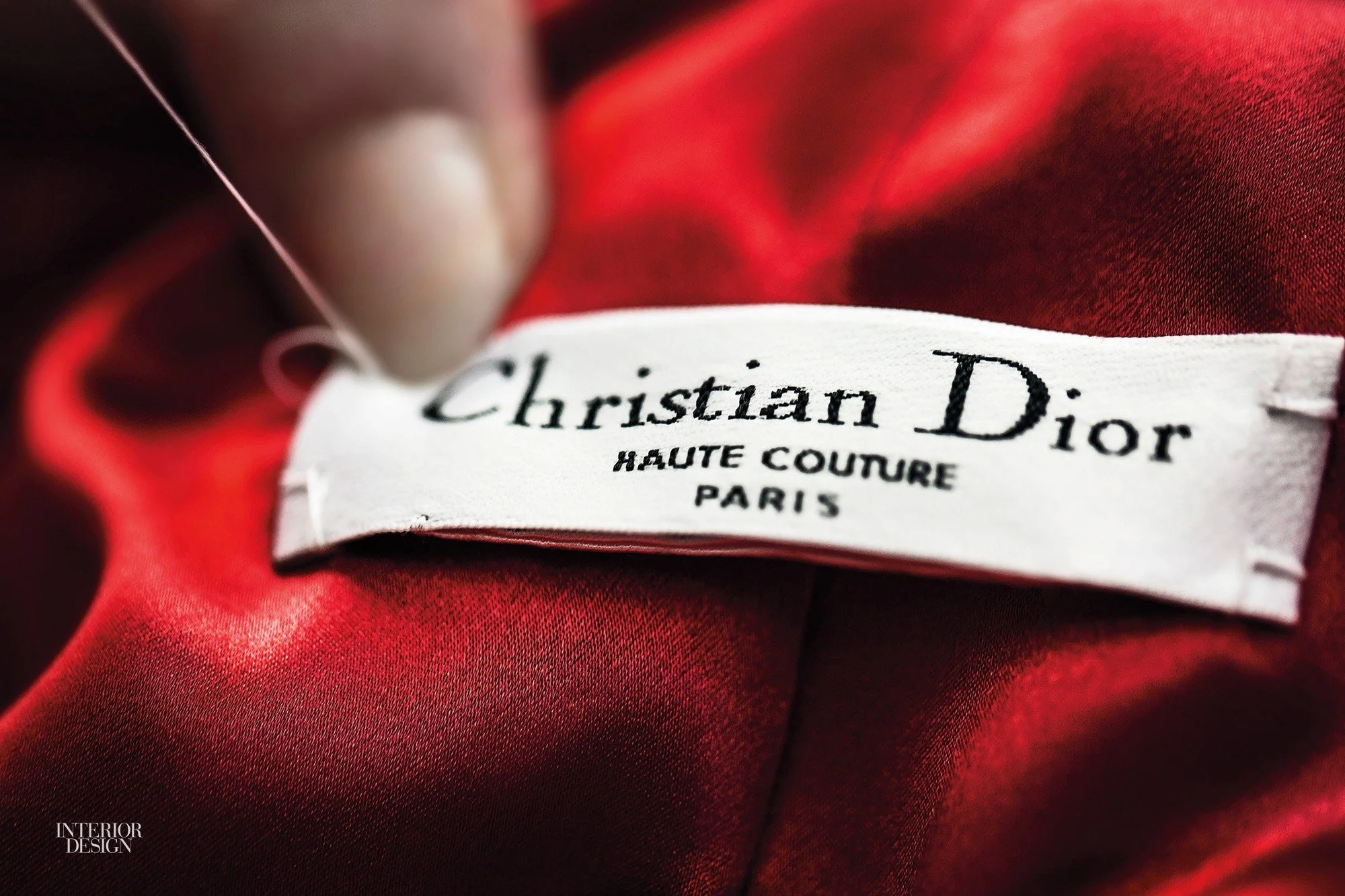
‘Fashion label’ originally meant just that: the name that was stitched onto the label inside a garment. In the early 20th century, few factories had the technology to use different colours or create the shapes of complex fonts on these labels; the label would either be a piece of ribbon of white cotton, the name of the atelier or dressmaker stitched in black on to it.
This led the way to many of the ‘handwritten’ style logos we’re used to today. Noticeably Oscar de la Renta’s brand is very close to the atelier’s actual signature.
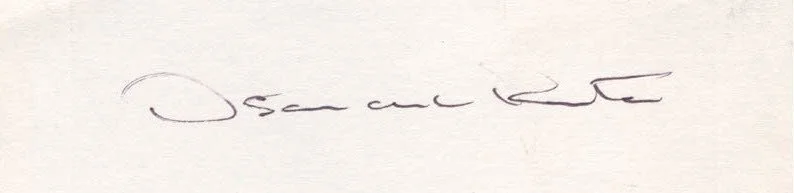
Above, Oscar de la Renta's signature, below, the brand’s logo
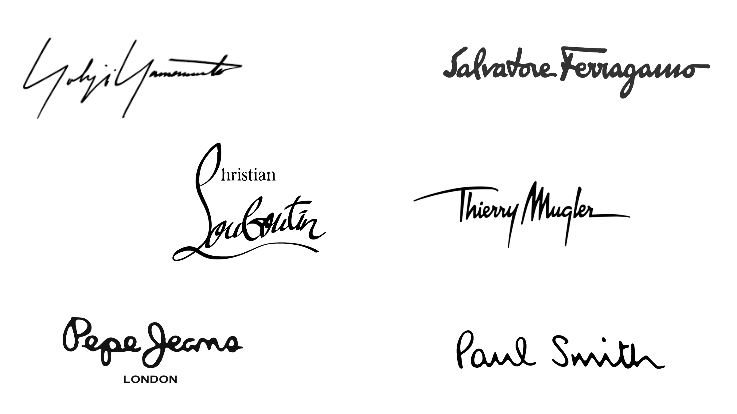
Other 'Handwritten' style fashion logos. Top row: Yohji Yamamoto, Salvatore Ferragamo; Middle: Christian Louboutin, Thierry Mugler; Bottom: Pepe Jeans, Paul Smith
The Birth of the Brand Mark
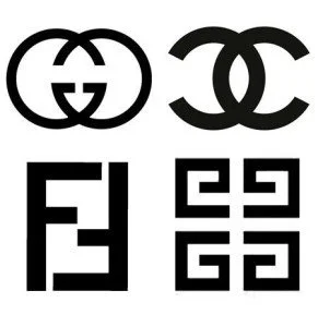
Chanel was one of the pioneers of having a brand mark – the brand’s iconic double C. The interlinking C’s is one of the most seminal and successful of all fashion logos, representing the whole brand in just two simple campaigns, handbags and jewellery.
And where Chanel led, many followed. In the 1960’s Italian leather goods brand Gucci began using a doubled G. Karl direction at Fendi’s in the 1970’s, led another Italian accessories maker to a wider audience, creating the double ‘F’ mark to stand for ‘Fun Fur’, and Givenchy’s Greek-key like logo, created by Pierre Dinand.
The Rebels
Kudos to the small group of fashion brands who dared to step outside of the ‘fashion box’ for their logos.
Vivienne Westwood’s Orb shows how this alternative approach can be equally as iconic. In rebellion is at the heart of the Westwood brand, so this is an especially relevant direction for the logo.
I will always find it refreshing when a brand opts for something that stands out from the marketplace.
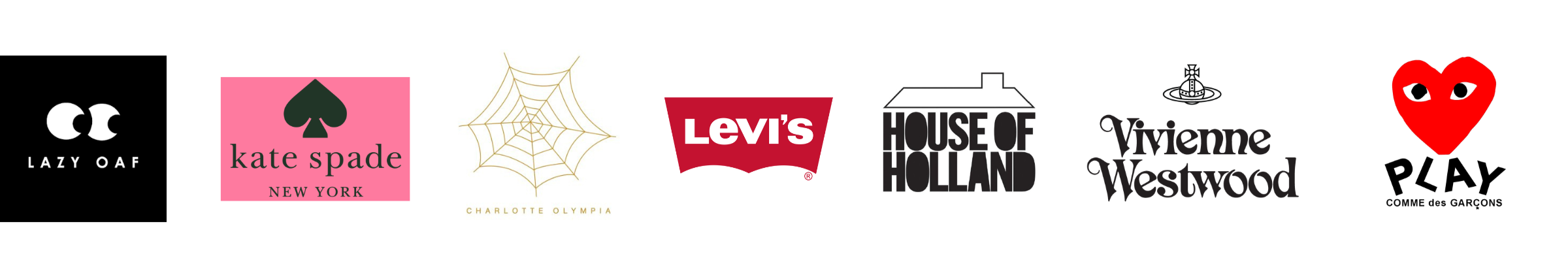
Doing it differently: Lazy Oaf, Kate Spade, Charlotte Olympia, Levi’s, House of Holland, Vivienne Westwood and Play by Comme des Garcons
Conclusion
The fashion brand has a tough role to play, collection after collection for years and often decades, it must represent that fashion house’s own brand, overarching numerous influences and references, colours, prints and stories for tens of, or even hundreds of, collections.
It needs to be able to work in a whole host of situations: in black and white, over campaign images, represented in small stitched labels, printable to receipts, swing labels and packaging – instantly recognisable, but equally open-ended, allowing the clothes to speak for themselves.
The logo is akin to an author’s name on the spine of the book, it ties the story back to them, but it is within the collections themselves that they create their stories. So long live typographic logos, providing the collections themselves continue to speak so loudly.