What Happened When I Tried 5 Free Logo Generators?
As a team of designers and marketeers, we know that there is no such thing as a one size fits all business logo – everything about your brand should be tailored to attract your target audience, and reflect your brand values.
With this in mind, it wasn’t an obvious thing for us to test a free logo creator; but with the emergence of more and more online options for small businesses starting up with small budgets, we wanted to see if our opinion was outdated, or if these programs offer a good ‘first draft’ to companies who can later refine their image, after understanding their own services more.
In each case I tried to put aside my doubts and, remembering my very first moodboard for my own brand, strived to create the best logo I could for my business, using these 5 platforms:
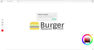
1. Graphic Springs
Graphic Spings promises a logo in under 1 minute…
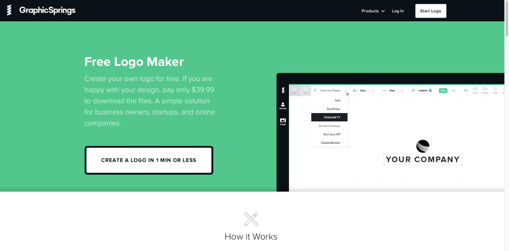
First impressions were quite good – the site looks clean and the colours and interface aren’t full of gimmicky ‘design’ or patronising language. I’m prompted to enter my business name and asked to tick the boxes of images that relate to my business – I follow their tip to select ‘Staff Favourites’, and since my search for ‘branding’ this time returns nothing, I opt for Business and Consultancy.
My joy with Graphic Springs ends here.
I’m faced with over 10 pages of generic ‘corporate’ clip art that would have best suited a business in 1982. Hand shakes, briefcases, trees in hands, arrows and globes…
I’m speechless that there is nothing at all for creative businesses, or for that matter, non-corporate organisations.
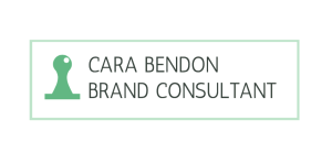
As always, I gave it my best shot of making something vaguely attractive, trying to act as I would have when I was very first looking into branding options for my own company. I opted for a swirly form that would feasibly pass off as my initials.
Despite considering myself fairly technically competent, I failed to master how to change my name font, to split the text over two lines or recolour the logo, so I ended up with this bland green ‘logo’, conveniently mocked up to a T shirt and then asked to pay $39.99 for the right to download it. I think I’ll pass, thanks.
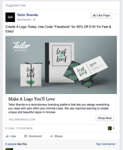
2. Tailor Brands
Advertised on Facebook with gorgeous contemporary images on packaging, I was secretly excited to try Tailor, the Pinterest of all free logo makers. First things first, it is suggested to me by a ‘helpful’ tip that my business name is too long, and that I should consider an abbreviation.
I sacrifice my first name to enable ‘Consultancy’ to fit in.
I’m prompted to write a little about my company. I write that I am a branding consultant who works with small businesses in London, and my words go off into the ether (I know this as I also tried the process typing in just ‘Potato’ or ‘City’ and it had no influence to the logos).
Next up is an optician-like ‘A’ or ‘B’ test to see which fonts I most like. (It worries me that it’s asking what I like rather than thinking what would appeal to my audience, surely this is where most small brands go wrong?). I’m asked to choose an icon to represent my business – it pulls in images from the website Nounproject.com so offers thousands of designs.
After searching ‘identity’ I choose a blocky, clean icon of a business card and letterhead and wait in eager anticipation while my logo is ‘designed’. To call it a design process would be an overstatement, I am presented with 6 logo options – all approximations of my one icon and preferred fonts – with no sense of proportion or relationship between the two elements.
Even if I had loved the logo, it would need a graphic designer to smooth it out.
I decide it’s hardly worth the $48 they are charging.
3. Logomakr.com
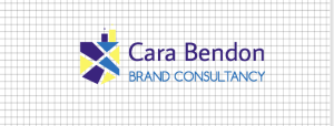
After a few helpful hints how to start you’re left to your own devices, and the website turns itself into a simple design program, allowing you to create shapes, icons, text and coloured fields that you can drag and drop into place with ease. Unfortunately the library of shapes is limited to triangle, circle or rectangle; but the graphics library pulls in results directly from Flat Icon (www.flaticon.com) so I’m spoiled for choice with thousands of results. To narrow it down I search ‘Branding’ and am offered 3 icons: a rubber stamp, an ID badge and some undefined but official looking globe with stars. I go simple and opt for the rubber stamp beside my company name.
Fonts are ‘helpfully’ categorised by style, which for some reason include ‘Dark and Scary’ which I’ll use should I ever promote a Scooby-doo themed Halloween party…
Settling for a simple sans serif font, I find myself quickly frustrated by the limits of the program. I add a mint green border rectangle to bring some softness to the logo and immediately dislike what I’ve created.
4. DesignMantic
DesignMantic’s site opts for a different approach – enter your business name and it will serve you logo options immediately – without knowing anything about your business. I’m pretty cynical about this approach, but can’t deny I’m having fun seeing all the potential options my business could have.
I select my industry (Media & Advertising) and am immediately shown 16 logos, all widely varying in style, with a high proportion of film reels making their way into logos, including what appears to be a burning Pizza, Emerald City emerging from a film strip and, bizarrely, a baby’s face nested in the letter ‘C’.
Searching for something more relevant to my business I search for ‘design’ and scroll through 4 pages of suggestions which are dominated by the notion that if you have a design business, you must be a hairdresser. Frustrated with this I then opted to go for a logo based on my initials and not an icon, but am baffled that the suggestions shown include ‘GE, GD and FC’.
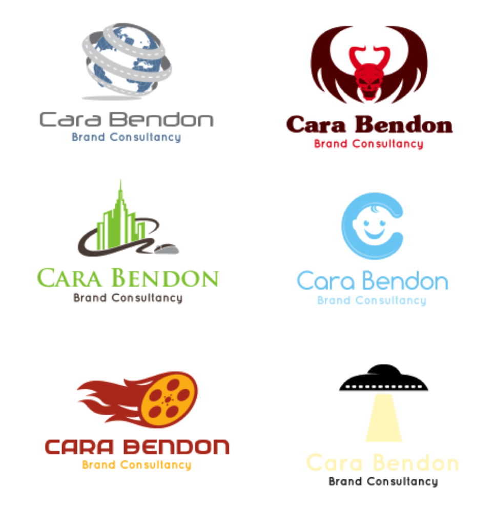
Having now got utterly confused what I was trying to achieve, I tried to bring myself back to what I was looking for when I first started out; I search for ‘pencil’ and end up with a cute geometric patterned icon, which I colour in my brand colours. I don’t dislike the logo, but it feels rather twee, and I can’t help feel the text looks rather unstyled next to this geo icon.
5. Hipster Logo Generator
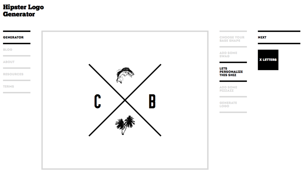
After the previous dated clip art suggestions, it seemed fair to try something that would produce a more modern brand. Admittedly Hipster Logo Generator was set up as a joke, specifically made to poke fun at the wave of businesses with ‘minimal’ logos featuring est. dates, crosses, initials, retro banners or the lot. From coffee shops to T shirt brands, despite being ubiquitous, this logo style is still incredibly popular with new brands.
While it would be possible to create something OTT if you added all the bells and whistles (or ‘swag’ in Hipster terms) which include a moustache (of course), pipe, fish and cow; the clean lines and simple palette make it easy for someone with zero design skills to produce something attractive.
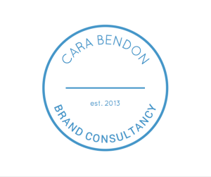
I opt for a circular brand mark and curved text to support the length of my business name, crowned with an established date which would be so much more impressive if it read 1973 rather than 2013, but oh well. I finish by colouring it a mid blue as a small nod to having personality.
I can’t deny I had fun with this experiment – after all, who doesn’t like to play around seeing different things ‘magically’ made within 30 seconds? And that, I feel, is the hook for these programs, not the logo file itself, which feels more like a come down when you are asked for hard cash for something you aren’t entirely happy with, that you’ve barely had a chance to review. All in all, I can see why these programs exist, but the bottom line is if you ask a machine to design your brand, it will be generic and stand for nothing.