

 Image 1 of 1
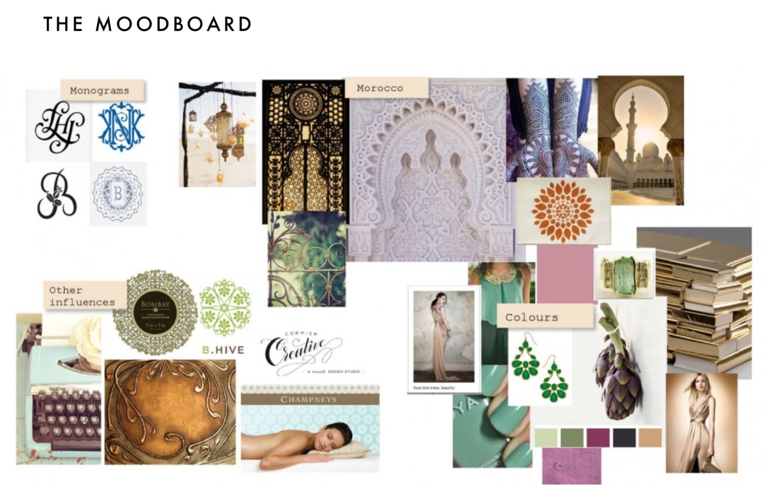
MOODBOARD
We created a moodboard of visual references for Claudine’s brand. Influences included intricate Moroccan gates and frames to reflect Claudine’s love of the country, and her travel writing.
After looking at competitors and considering Claudine’s target audience (magazine writers and lifestyle section editors) we decided that Claudine’s new brand should convey the personality and style of her writing, while also making her look professional and confirming her status as an experienced writer.
LOGO
We came up with three different concepts for Claudine’s logo, each referencing the Arabic influences, traditional monograms and soft gold, green and coral colours from the mood board.
We decided to develop route no. 3, taking the roundel and incorporating Claudine’s initials within it.
THE DESIGN DEVELOPMENT PROCESS
After exploring colouring, we settled upon a crisp mint green disk framed with regal gold as Claudine’s logomark, with her name and title, Wellbeing Journalist, beneath it to form the full logo.
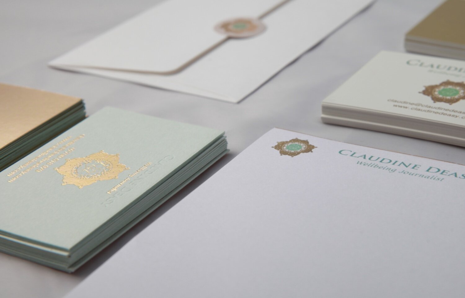
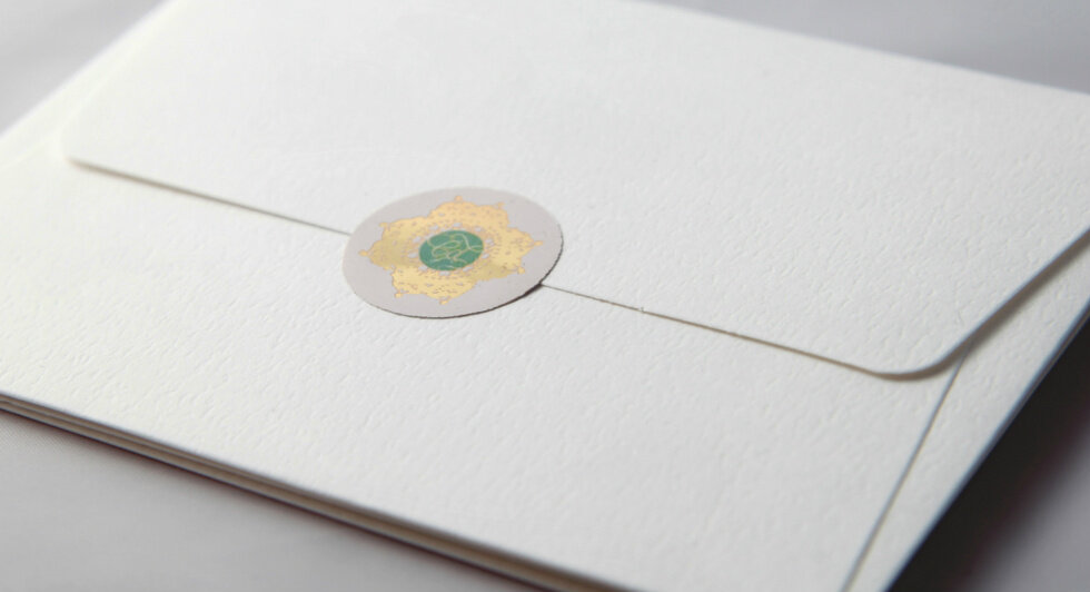
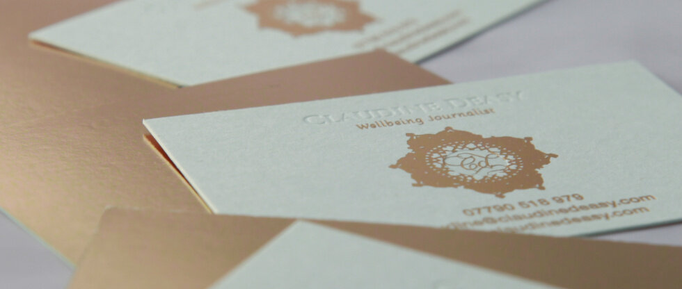
APPLYING THE BRAND
With the brand complete, we designed a suite of stationery for Claudine to create a professional image.
We created two sets of cards for Claudine: one luxury embossed and gold foiled for editors and one printed with a subtle metallic effect, so that Claudine has cards on hand when networking
We also did a professional photoshoot for Claudine, so that she had up to date portraits and imagery for her site. The colours green, cream and gold appear throughout these photographs to maintain a consistent colour palette.
As well as creating a branded email signature for Claudine, we created letter templates and envelope seals for more traditional correspondence.
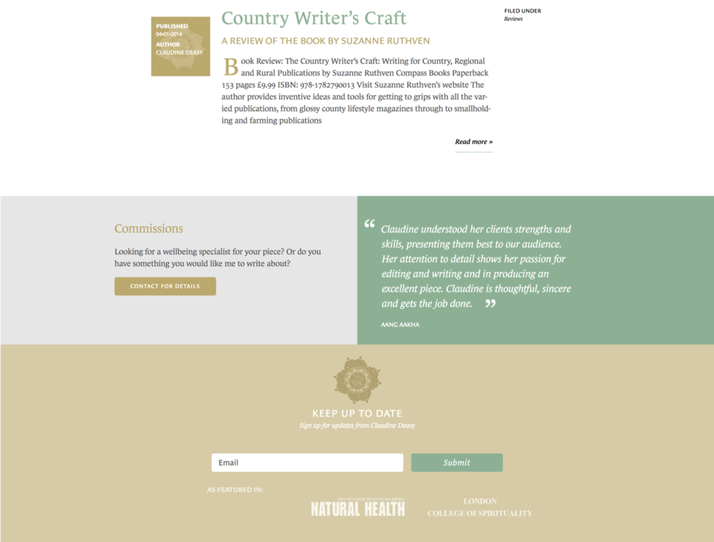
WEBSITE
Working with web designers Girl & Boy, we art directed and managed the design of a fully responsive website for Claudine. As well as presenting the brand, the website shows off Claudine’s writing experience and has been designed to allow her to write new articles with freedom.

Visit her site at www.claudinedeasy.com