How We Helped Liz Fall Back in Love with her Brand, with Brand Buff
Situation:
Liz is a fine jewellery designer who connected with me in Spring last year. Over our first call, she shared that she had won several awards for her jewellery, but was struggling to make her brand feel as high-end as it needed to be to attract her ideal customer, but she didn’t know what was missing.
As an innately creative person with a good eye for design, Liz had created her own branding, and had ticked a lot of boxes for “premium branding”:
✓⃝ She had used her own name, positioning herself clearly as a designer-maker (rather than a more mainstream jewellery brand).
✓⃝ She had a clear signature style of jewellery design.
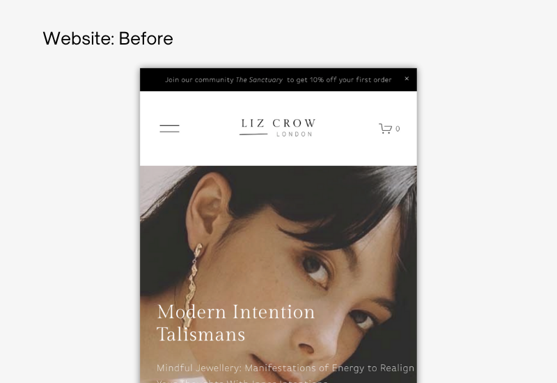
✓⃝ She had gone for a minimal monochrome look, with a serif font, to give a trusted and luxury feel.
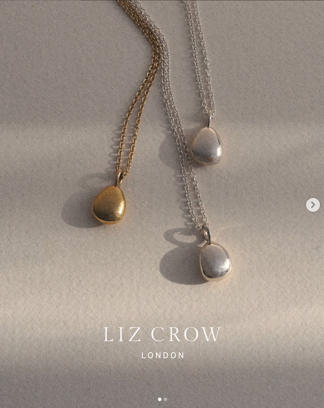
✓⃝ She even had gorgeous professionally modelled images to showcase her creations…
…Lots of boxes ticked, but still something was missing.
And it was Liz!
My take:
The minimalism in Liz’s branding was actually masking her brand’s uniqueness, letting it get lost among a sea of sameness.
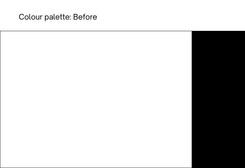
From a psychology point of view, black & white brands are a little harder for us to remember, as we latch on to colours to give us mental cues. To put it simply, our brains use a brand’s colours to remember them.
In trying to appeal to a high-end audience, Liz was also struggling with knowing how much of her own personality felt right for the brand (which is a valid and common concern!), and in doing so ended up playing it safe.
And yet, we know that people connect with people, and that storytelling is the most powerful sales tool..
There is a common idea that to be luxury, you have to be minimal, and that is largely thanks to the fashion world.
But it’s a misconception.
The things that really look premium? The things that look considered.
And so that’s what we did.
Process:
We began with Liz’s logo
We looked at every part of Liz’s brand in detail, ensuring everything was aligned and in harmony, starting with her logo:
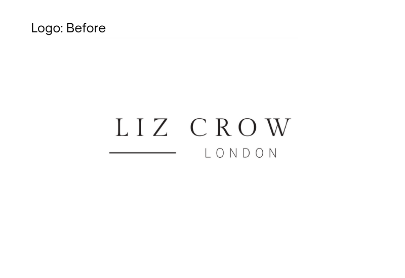
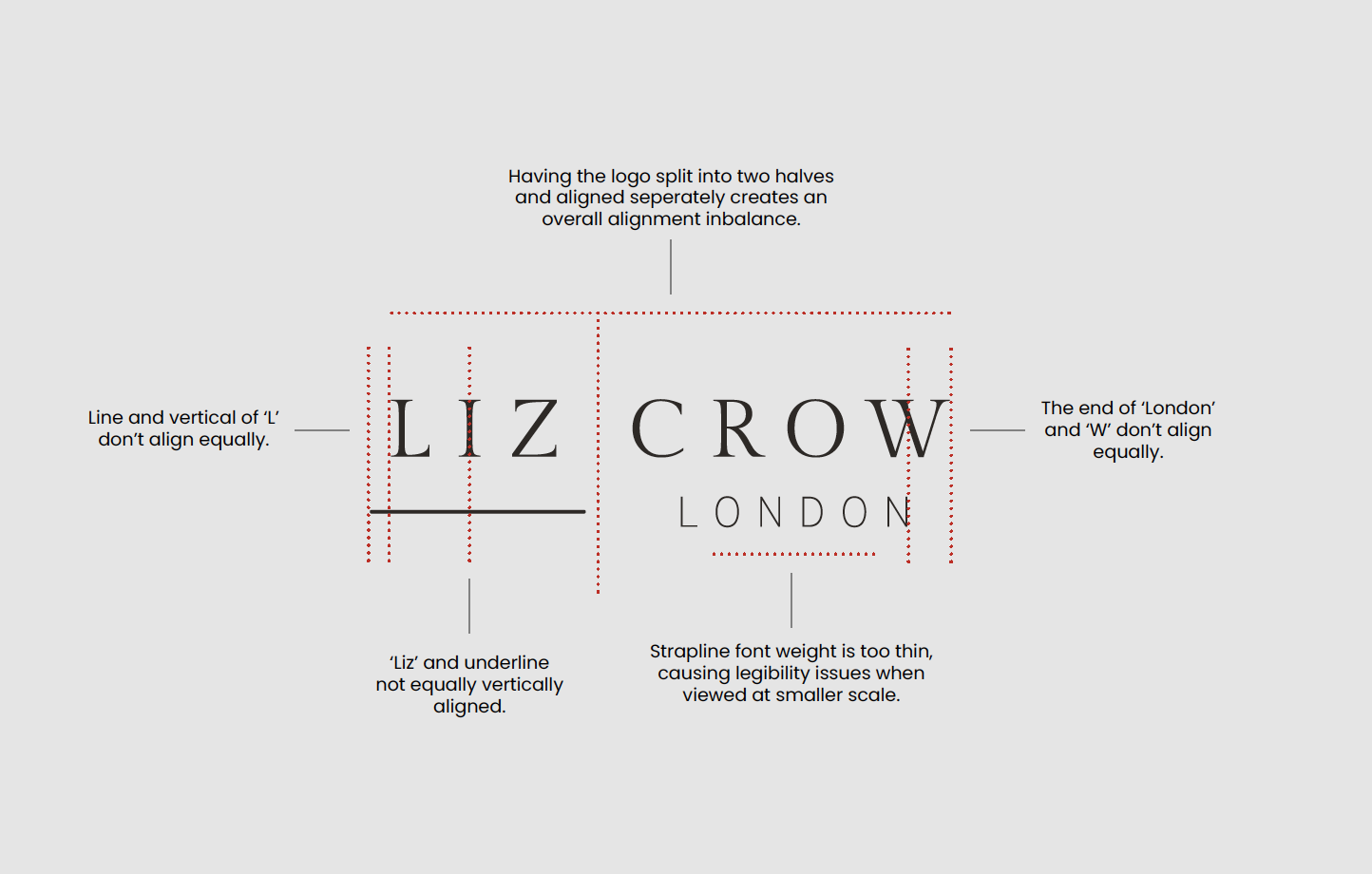
Liz’s original logo, and below, our notes on what changes we suggested
We first addressed the alignment and font weight issues we saw in Liz’s current logo, before deciding together that it was actually cleaner and chicer without the line at all!
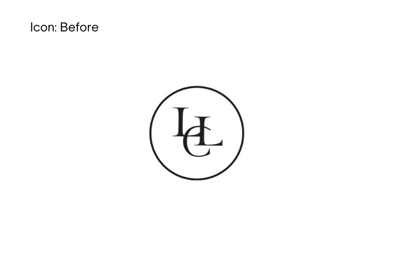
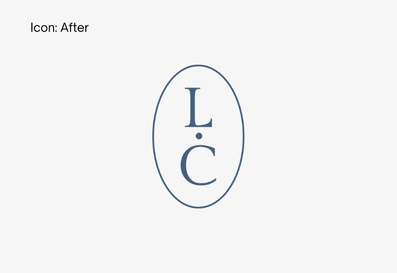
Liz had also designed her own monogram as a brand mark, but it was a little crowded featuring three letters, overlapping in ways that felt a touch messy rather than the simplicity of form that you would generally associate with luxury. We made the decision to just focus on two initials very early on in order to strip the mark back, and after exploring several layouts, we decided that an oval made for a more natural - and more unique - shape for her monogram than a circle did.
Before: The 3 letters were overlapping and the outcome was busy and confusing.
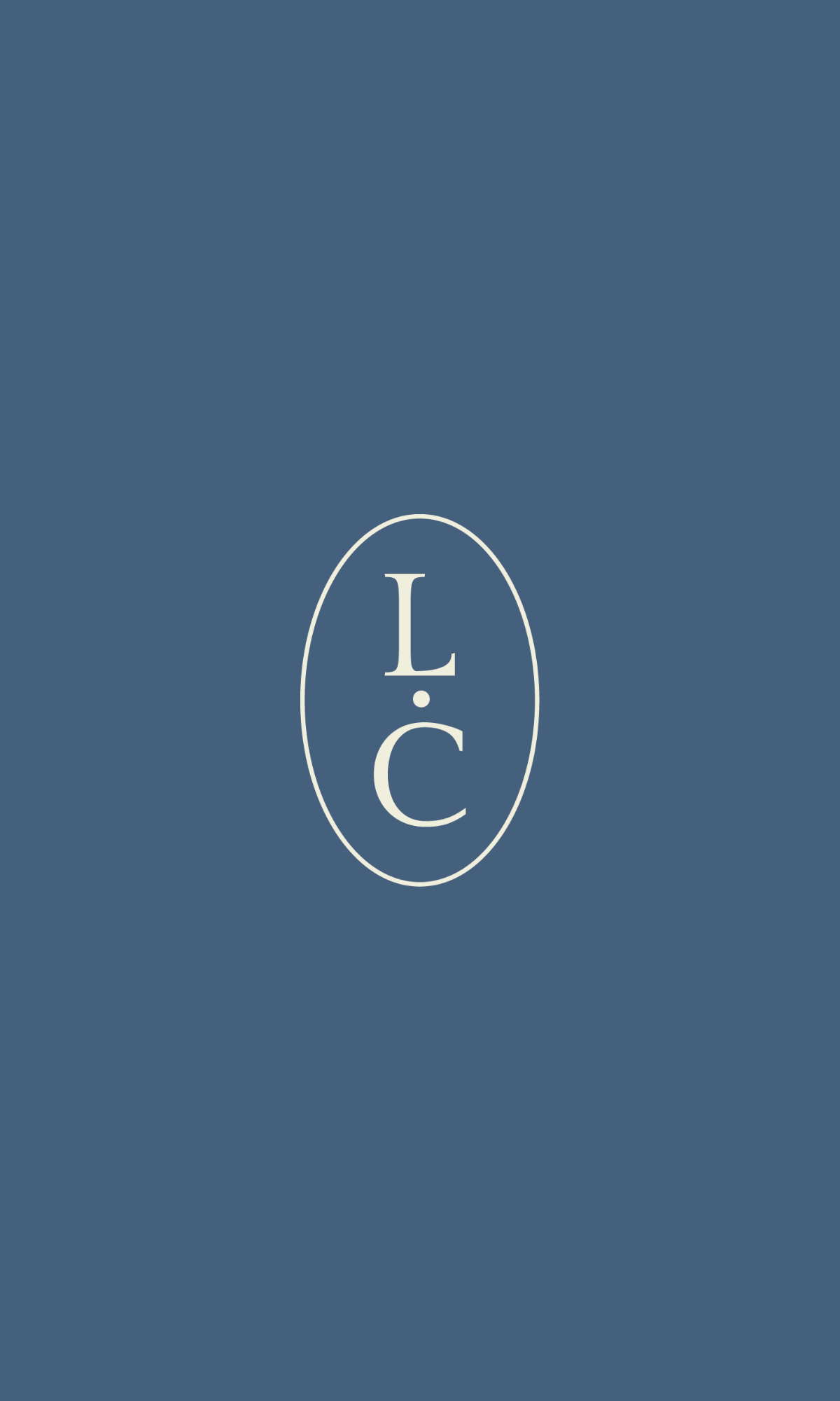
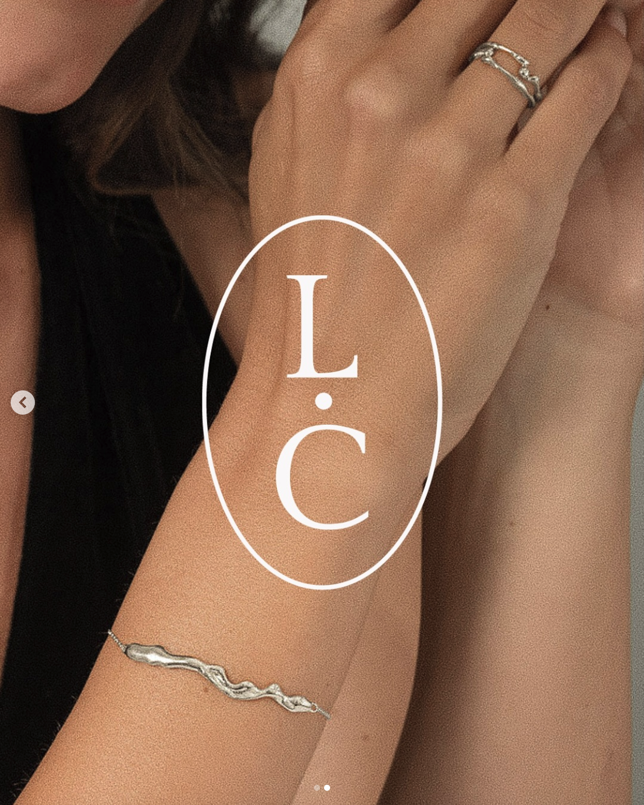
After: Stripped down to just LC, the monogram looks polished and elegant in its new oval layout. (It also looks closer to a jewellery hallmark too, which felt fitting).
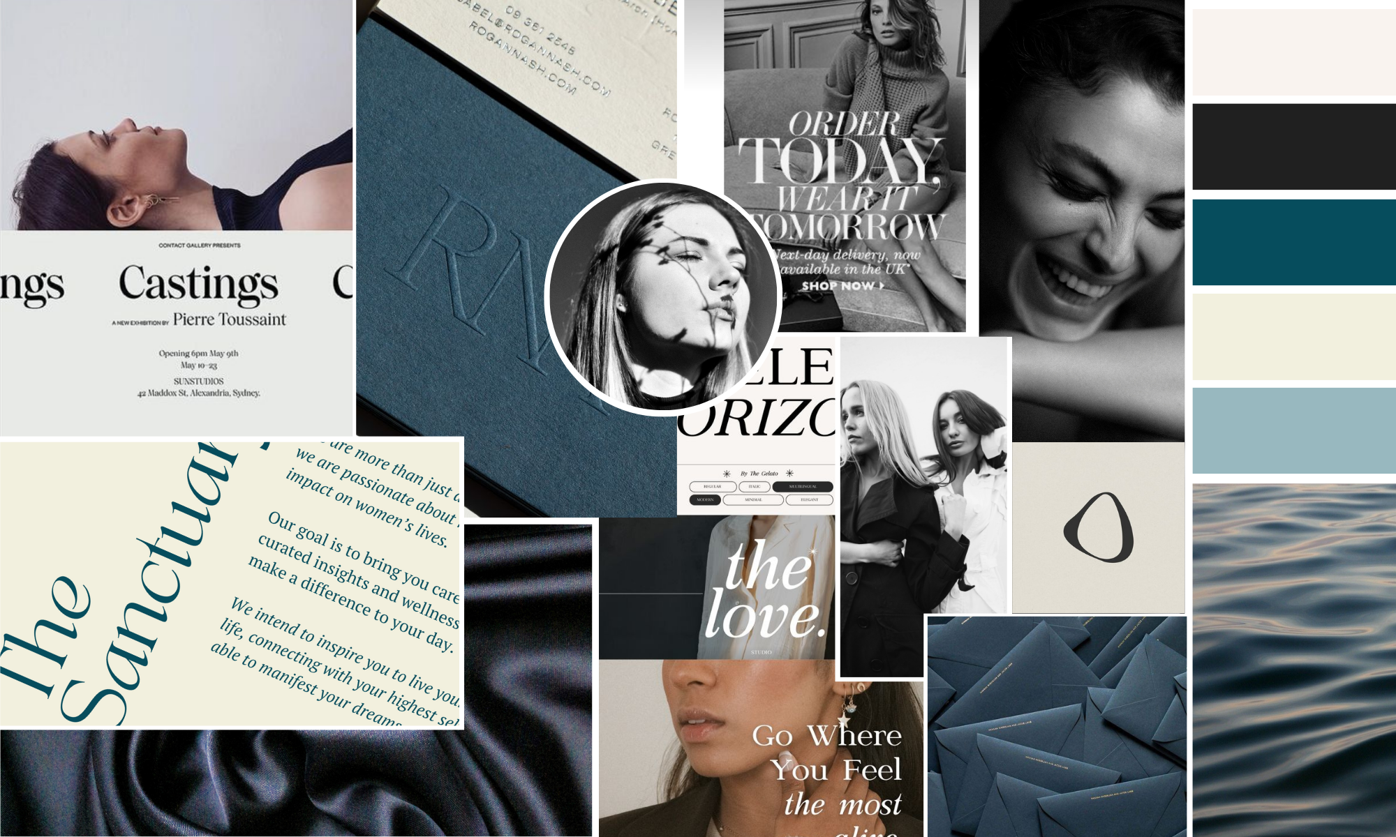
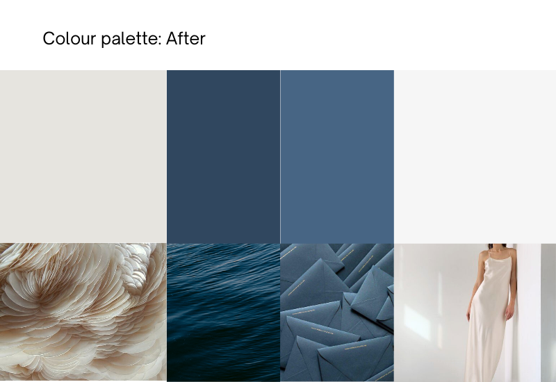
I had recommended to Liz at the beginning that we opt for an accent colour for her brand, and suggested blue to connect with Liz’s inspiration often coming from the ocean. After initially pitching a brighter blue for a bit more ‘pop’, Liz and I collaborated closely on the colour palette, landing on a more teal-blue option that felt nuanced and brought softness to the brand, and could be used with both black & white and colour photography:
Liz’s brand refresh moodboard: Full of editorial references, with a strong femininity and sensuous textures.
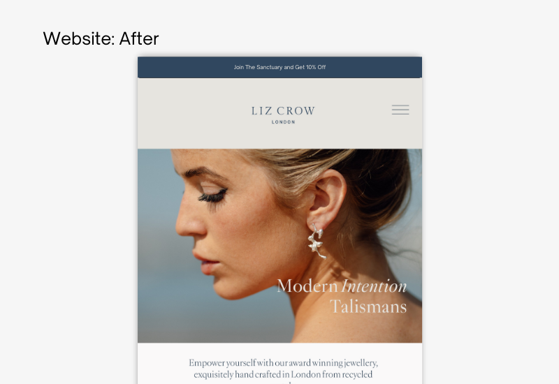
Liz’s brand had previously been primarily just black and white, but this shift in colour palette immediately injected some individuality into the brand, as well as bringing some much needed softness to the website, making it feel much more relaxing to browse on.
After: Ocean blues & off-white create more visual curiosity, and feel more harmonious with Liz’s photography:
A ‘molten’ brand icon
We created an icon that communicated the aesthetic of Liz’s molten effect designs. The shape was largely inspired by the pendant on Liz’s ‘The Knowing’ necklace.
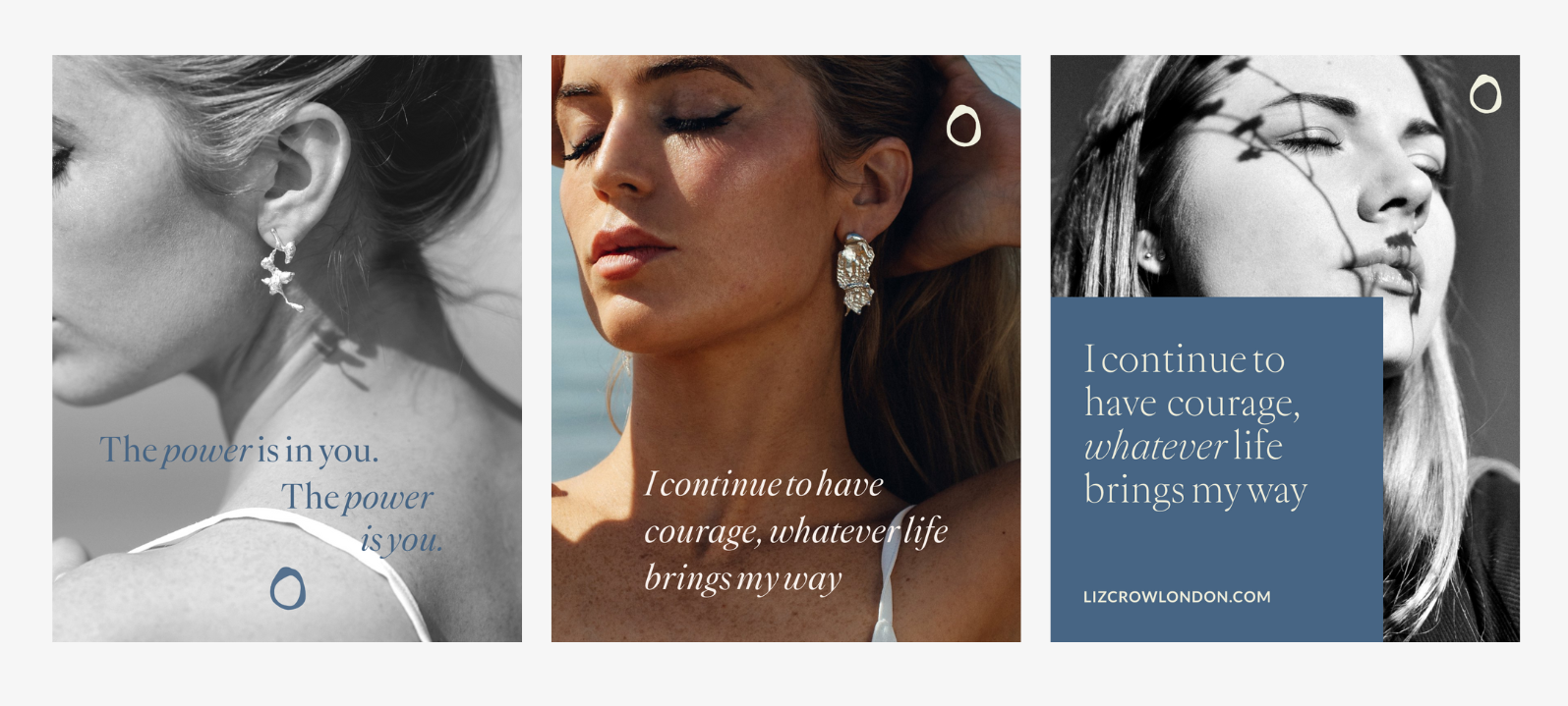
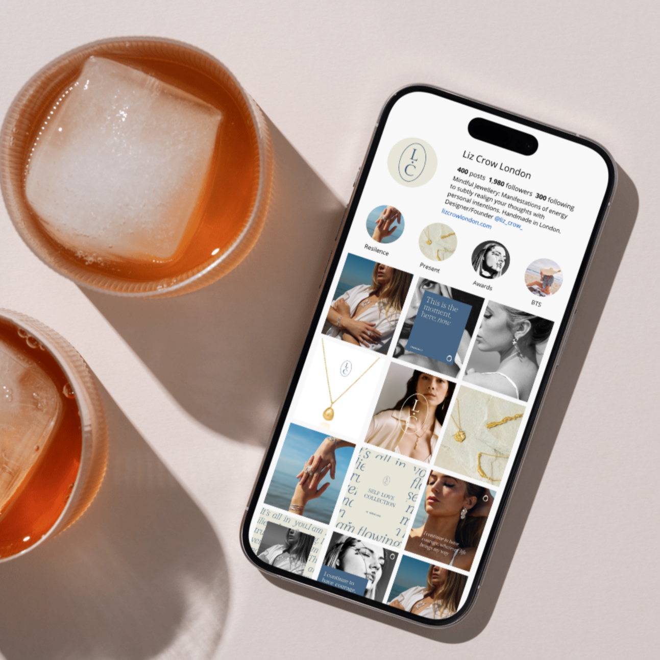
Example usages of Liz’s new brand icon on example social media posts in her new brand style
Typography
Finally, we chose typography that felt aligned with both Liz’s high-end audience and the values of self-reflection and intention setting (which inform her pieces).
We also created more space in the brand for the messaging of self care, ritual and intention setting.
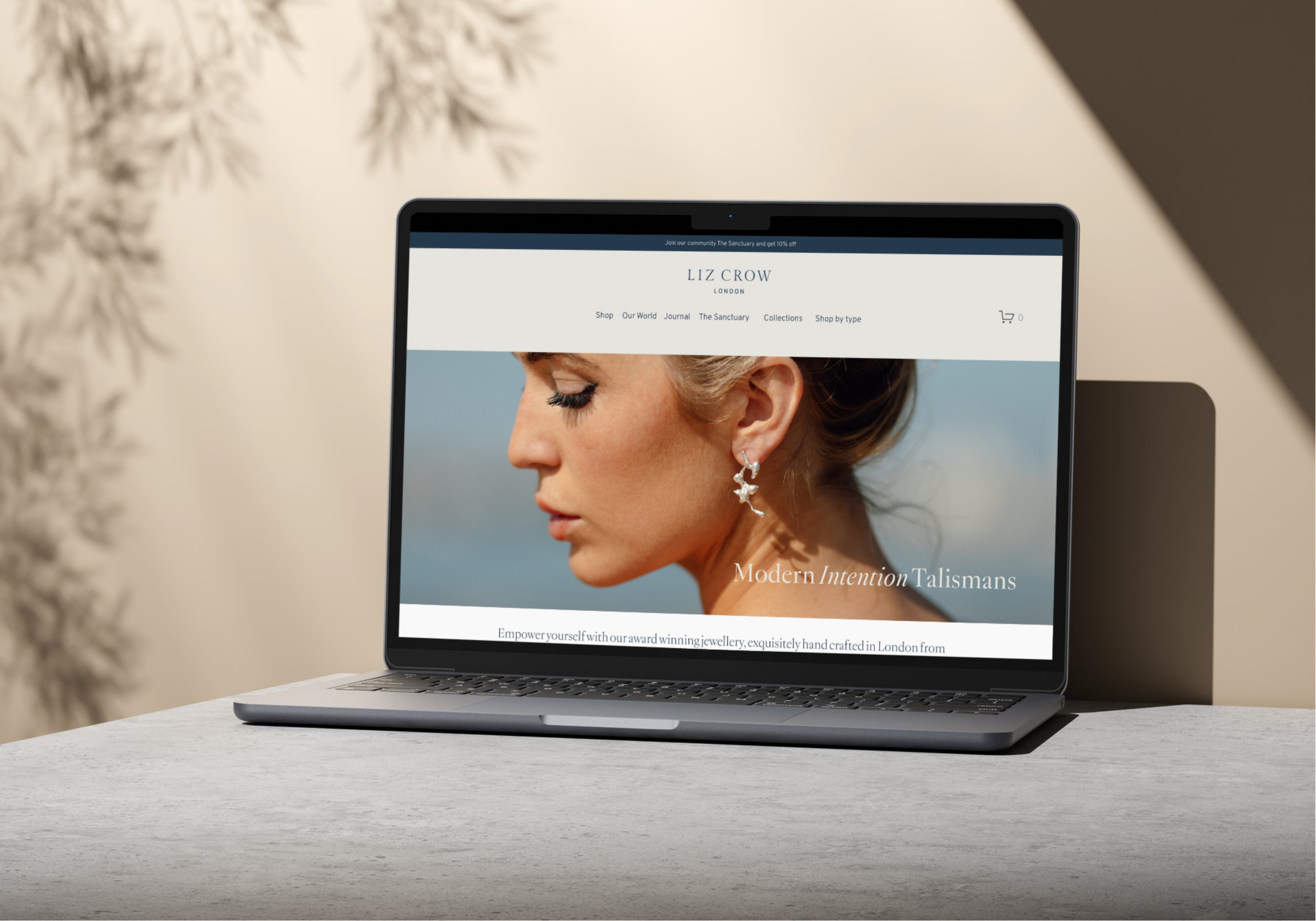
The end result? A brand that feels entirely Liz - elegant, feminine & refined - that also connects the brand with her inspiration of water, and that looks incredibly premium and professional.
"I came to Cara feeling like my brand needed to be elevated but I wasn't sure exactly how.
Cara agreed that quite a few elements were in place but suggested some tweaks, and they really changed the overall feel.
I had previously designed my own logo, but Cara used her experience to suggest a tweak which really made it feel more elevated and professional. For quite a small change, the before and after is really significant and I'm so happy with it!
Cara and her team also developed the logo into different colours including a light logo that can be placed on images, which I use a lot. Cara also took my clunky monogram and created a new, simpler one that is so on-brand. I get lots of comments about how premium and beautiful both look.
We also worked on a new colour scheme, replacing my monochrome look - which I was hesitant to change! - I'm so happy with the palette we chose, it really elevates it.
What was great about working with Cara is she really understood my brand and made suggestions that felt fresh but also perfectly suited. A full rebrand wasn't what I needed, just some small very highly effective tweaks. So happy I found Cara!"
Liz Crow
Brand Buff is our popular brand refresh service, that can breathe new life into your branding and elevate it completely in just 1 month. If you enjoyed seeing Liz’s Brand Buff journey and would like to explore your own, please visit the Brand Buff page to find out more, or drop Cara an email!
