 Image 1 of 2
 Image 2 of 2
Discovery
With a crowded marketplace, we discussed with Karlene how we should stand out. We decided on an approach that looked professional but chic would speak most to the target audience.

Logo
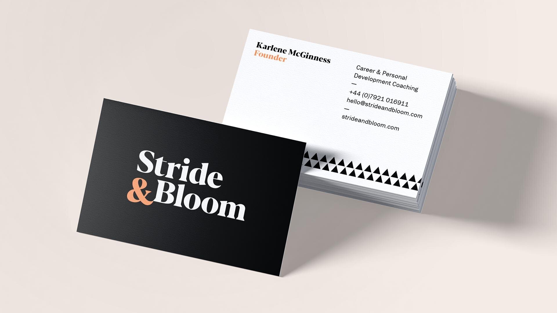
Rather than conveying the ‘bloom’ aspect with flowers, we instead decided to go for a simple typographic logo that instead represents the woman who will work with Stride & Bloom: chic, professional and modern.

We presented several typographic routes, and the client chose the stacked serif option, bottom right
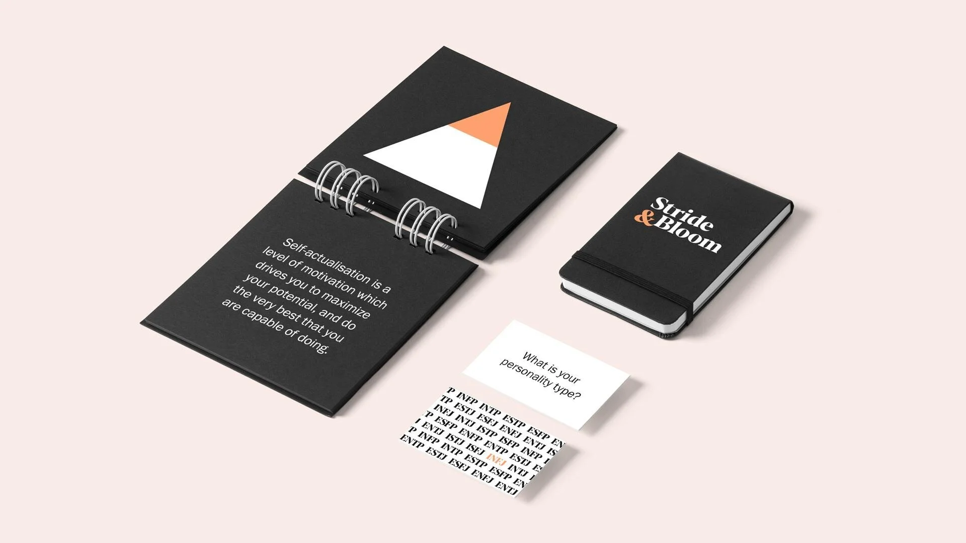
We evolved the logo styling choosing a feminine rounded serif with clean angular detailing to bring the logo up to date and show that Stride & Bloom means business. Working from the initial moodboard palette of monochrome and blush, we decided on a pop of orange to add warmth and power.

Identity
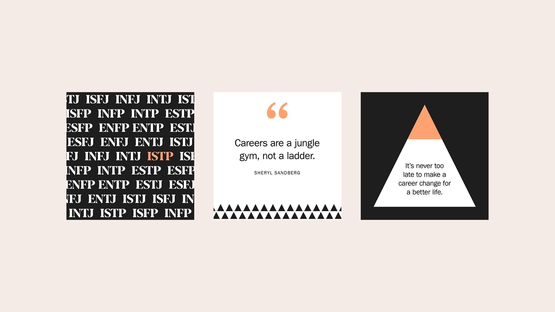
We opted for a bold geometric pattern to convey a sense of order with measured steps, mirroring the brand philosophy.

Collateral
We provided art direction to Karlene for her website and photoshoot and designed her a suite of graphics inspired by the Meyers Briggs personality types and other coaching models, for use on social media.