

 Image 1 of 4
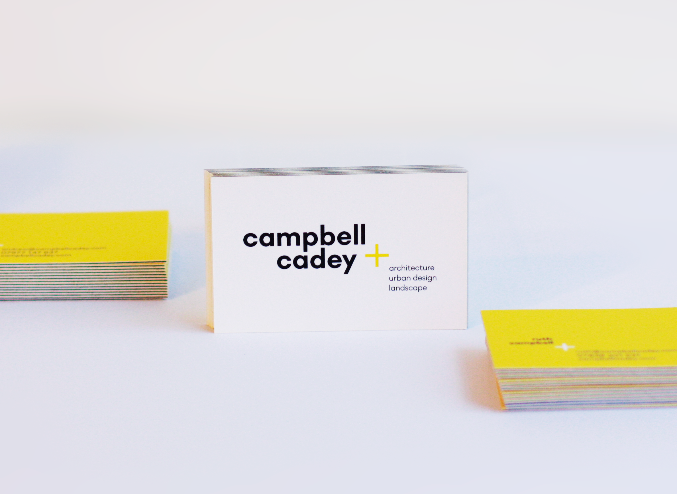 Image 2 of 4
 Image 3 of 4
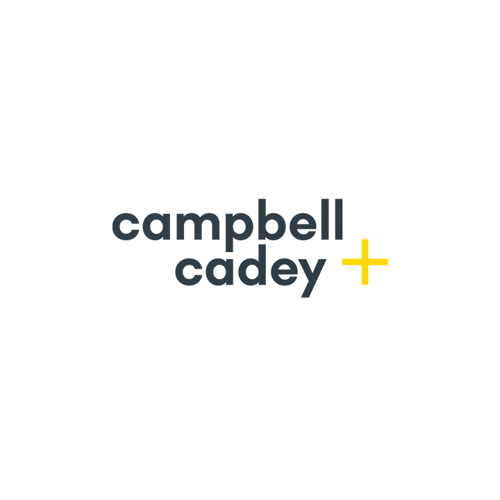 Image 4 of 4
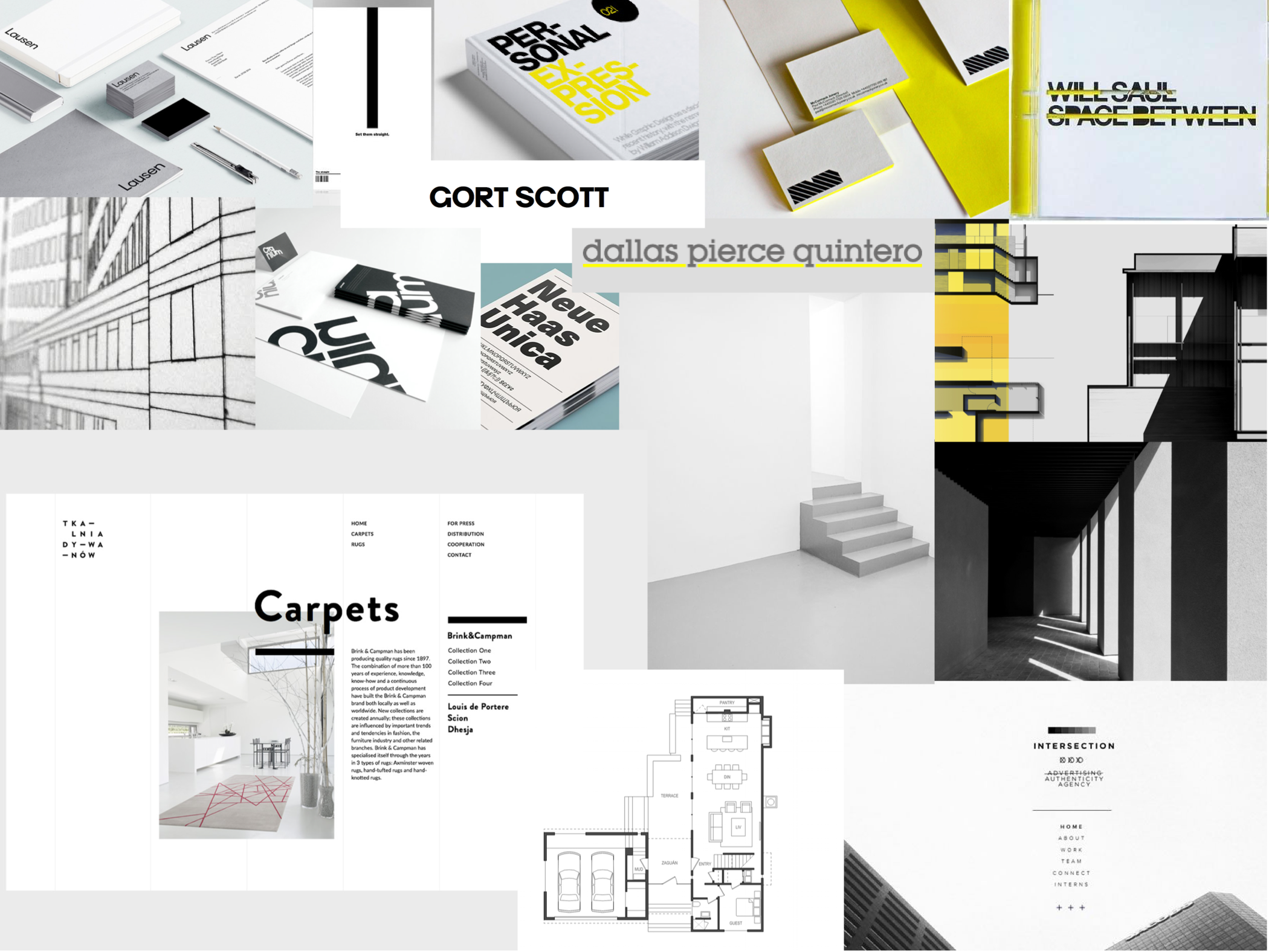
MOODBOARD
Ruth and Andrew wanted a clean and minimalist brand identity, and we soon landed upon yellow as an accent colour for them having seen it in one of their sketches and enjoyed the vibrancy beside grey and white.
THE LOGO
We wanted to reference architectural form in an abstract way in the logo and eventually found that a plus symbol had multiple meanings that could be useful for the brand -not only does it create a strong visual shape, it also represents that Campbell Cadey find ways to add a dimension to spaces and their guiding belief that great spaces are about more than bricks and mortar.


COLLATERAL
We also supported Campbell Cadey with design and production of triple ply business cards with black seams, and design art direction for their new website, where the yellow and + motives are carried through, framing their design projects with style and character without being overbearing.


